A collection of the best blue gray paint colors along with examples in real homes! There are so many beautiful, serene options that work well for walls, doors, and more!
Today’s post is an exciting one! I’m finally sharing our freshly painted interior front door along with the best blue gray paint color options! I spent a lot of time researching the perfect blue gray paint color to use, and I think I found a winner for our home. But, because natural lighting can play such a huge factor in how a color looks in a home, I’m sharing my other top picks for you, as well!
This post contains affiliate links for your shopping convenience. Click here to read my full disclosure policy. This post was originally published March 22, 2019, but I am sharing it again today with some slightly updated information!
The Best Blue Gray Paint Colors
Previously our front door was painted Benjamin Moore Hale Navy. I actually really loved the color but it felt a bit dark in this area of our entryway that doesn’t get a lot of natural light. The door had also gotten a bit beaten up during our kitchen renovation last summer and was in need of fresh paint regardless. I decided I wanted to go with a muddy blue gray color with slight green undertones (versus purple). Something that is calming and serene and reminds me of the beach, but without it being too saturated or “baby” blue. And although I used blue gray paint in more coastal-inspired rooms, the shade can be equally as beautiful in more modern spaces!
I spent several hours researching online as well as asking many of my readers what their favorite options were. After compiling all the results, I’m sharing the best blue gray paint colors! Somewhat surprisingly, not one Sherwin-Williams paint color made the list. I think they excel on the slightly greener versions of these colors (like Sherwin-Williams Sea Salt). Following are my top picks for the best blue gray paint colors!
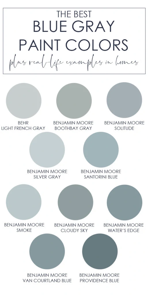
Further down in this post, I’m sharing real-life examples of how these colors look in real spaces! I’m also sharing a fun update to our entryway using my new favorite blue gray paint color! If you’re wanting to try large, pre-painted samples, I’d definitely look into Samplize for picking the perfect blue gray paint color for your home! Their peel and stick samples are made with real paint (not dyed to mimic the color) so it can definitely help narrow down your top picks.
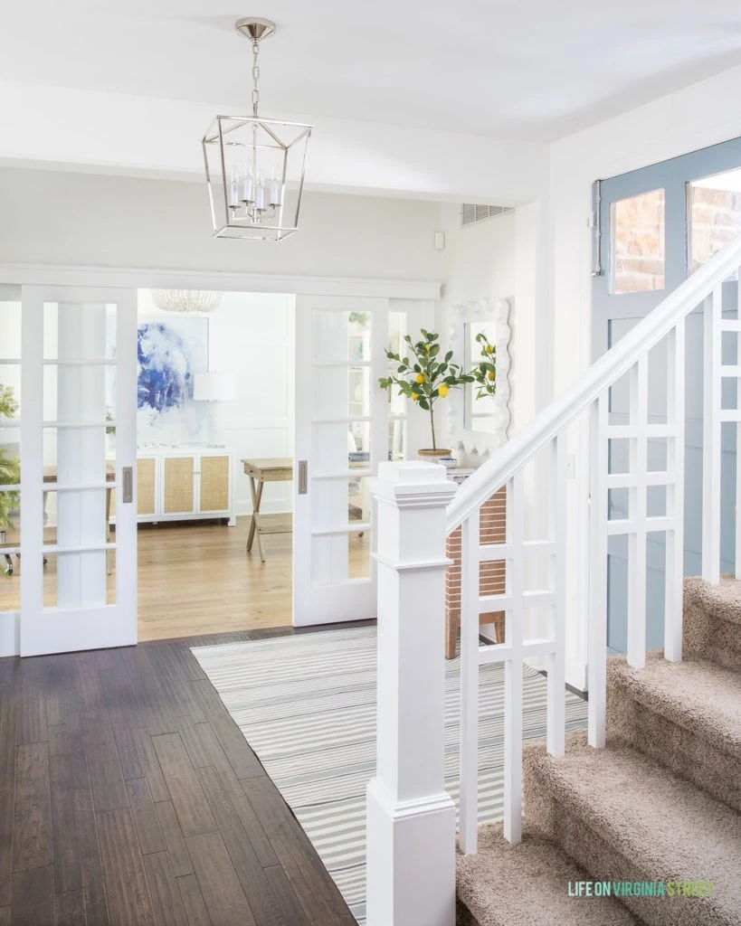
Our Interior Front Door: Benjamin Moore Water’s Edge
In early 2019, I tested three color samples on our front door. From left to right you can see (all Benjamin Moore): Wedgewood Gray, Van Courtland Blue, and Water’s Edge. All were such beautiful options that I don’t think we could have gone wrong with any of them!
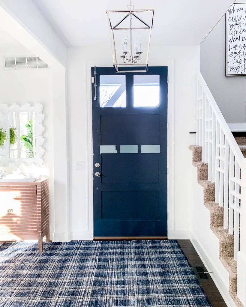
SOURCES: Plaid Rug | Chandelier | Cabinet | Mirror | Door Surface Bolt
Painting the interior of your front door is such an easy project! Not only is it super affordable, it can be done in a few hours, even with multiple coats! You can see my method on how I paint our front doors in this post.
This time around, I actually just ended up using the sample pot of paint from the Benjamin Moore store! I selected Benjamin Moore Water’s Edge and couldn’t be happier with how it turned out! I’m also just a tiny bit obsessed with our striped rug. It’s indoor/outdoor and virtually indestructible! It comes in multiple sizes but sometimes they split them as individual listings.
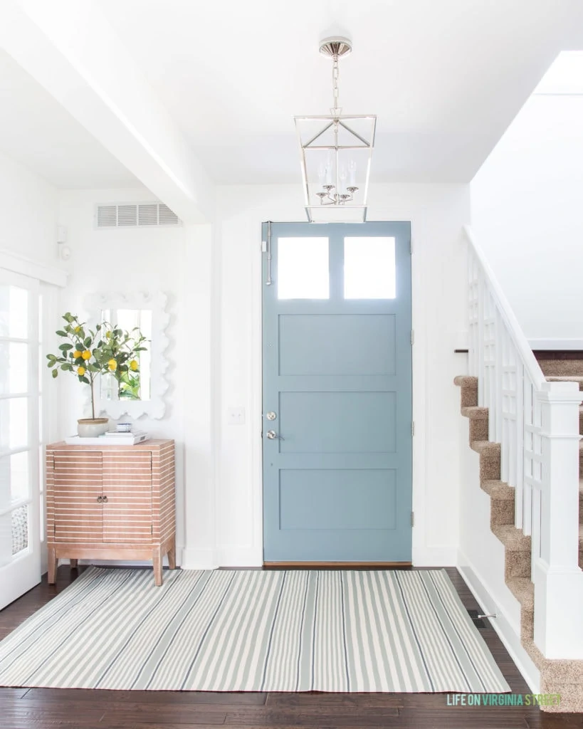
ENTRYWAY SOURCES: Striped Rug | Cabinet | Lantern Pendant Chandelier | Faux Lemon Tree | Mirror | Door Surface Bolt
The new serene color looked equally as beautiful paired with the Benjamin Moore Hale Navy that used to be on the wall in our office!
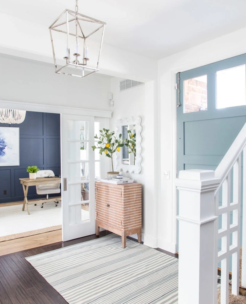
More recently, we painted the board and batten wall in our office Benjamin Moore Simply White (like the entryway walls). We love this color combo pairing just as much!
HOME OFFICE SOURCES: Cane Cabinet | Similar Wood Desks | Linen Desk Chairs | Similar White Wood Bead Chandelier | Faux Fern Pots | Abstract Art | Marble Chain | White Bamboo Lamp – HomeGoods (old)
Following are even more of my favorite blue gray paint colors for creating a calming, serene effect in your home!
The Best Blue Gray Paint Colors in Real Spaces
When I’m on the hunt for a new paint color, I love being able to see real homes with colors I’m considering. It can definitely help narrow down the selection process! Following are some examples of the best blue gray paint colors in real spaces!
Benjamin Moore Providence Blue
In our kitchen remodel, we used Benjamin Moore Providence Blue and absolutely love how it turned out! This space get a lot of natural light from multiple angles so the color looks a bit lighter here than it likely would in most spaces. However, it’s a beautiful darker blue gray paint color option! It’s also very much a chameleon color that takes on more gray or green tones depending on time of day and angle of the sun!
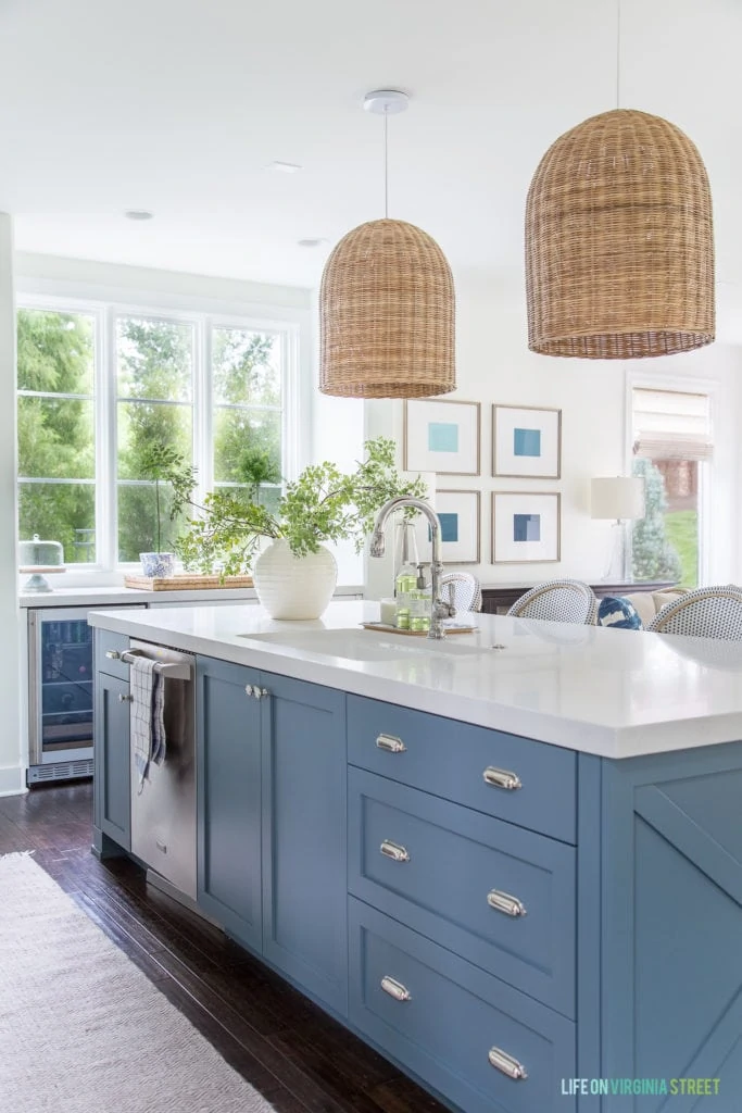
KITCHEN SOURCES: Basket Pendant Lights | Bistro Counter Stools | Indoor/Outdoor Runner Rug | Cabinet Bin Pull Hardware | Cabinet Knobs | Similar Vase | Faux Greenery | Wall Color: Benjamin Moore Simply White
Benjamin Moore Van Courtland Blue
The gorgeous laundry room cabinets below are painted Benjamin Moore Van Courtland Blue which seemed to be a super popular pick among readers!
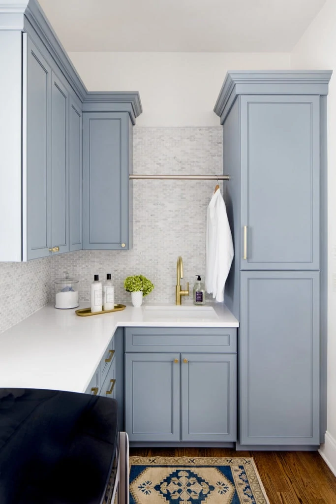
As an update to this original post, I actually used Benjamin Moore Van Courtland Blue in our den earlier this year. It looks very different in our home than it does in the home above. But both versions are equally as beautiful! Our den faces east, so it gets a lot of warm morning sunlight, tinting the color slightly more green. I’m guessing the laundry room above doesn’t get much direct natural light and may be one of the biggest reasons for how different they look!
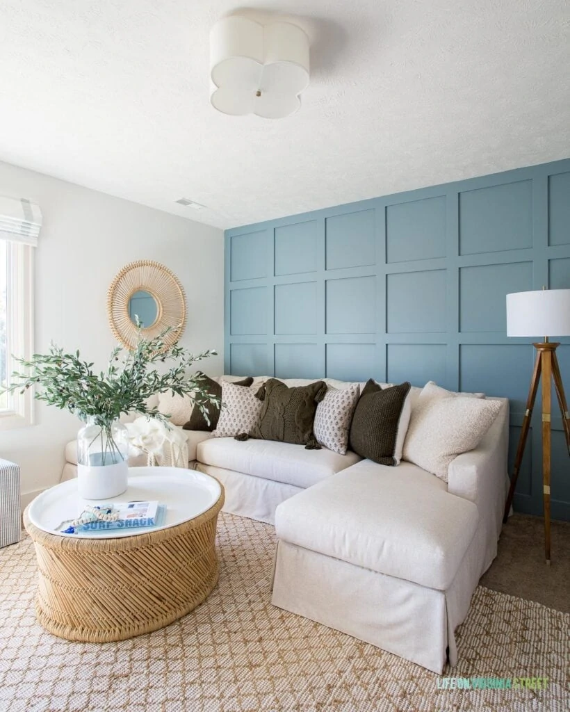
DEN SOURCES: Linen Sectional | Rug | Storage Coffee Table | Paint-Dipped Vase | Faux Olive Stems | White Bone Beads | Coffee Table Book | Scalloped Light Fixture | Similar Rattan Mirror | Striped Ottomans | Boucle Pillows | Waffle Knit Reversible Sherpa Pillows | Block Print Pillows | Chunky Knit Tassel Pillow | Tripod Lamp
Benjamin Moore Boothbay Gray
Perhaps the grayest of all the options, Benjamin Moore Boothbay Gray is a super popular choice on doors (interior and exterior) right now! It’s another chameleon that will look blue in some lights and very gray in others. I’ve actually tried samples of this color personally, and it looks very gray in our home, but I’ve seen it with beautiful blue tones in other homes.
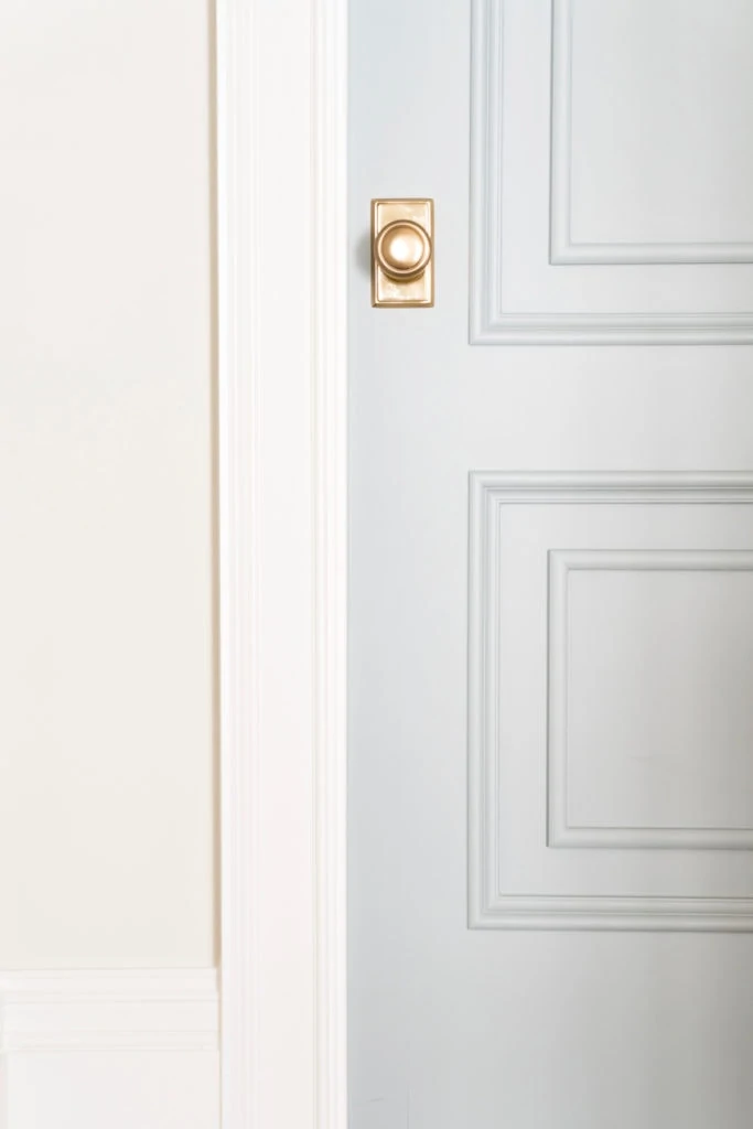
Behr Light French Gray
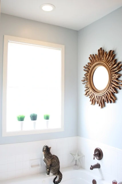
In our last home, we used Behr Light French Gray and it had a really beautiful tone to it (as do the colors one shade lighter and darker on the paint swatch). It’s a beautiful light toned paint that looks more blue in some lights and more gray in others. It creates a calming and cooling vibe to any space and we loved having it in our bathroom!
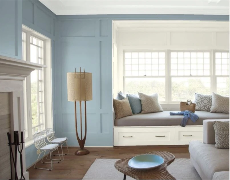
Benjamin Moore Santorini Blue
Benjamin Moore Santorini Blue is another gorgeous blue gray paint color option, as shown in the living room below! This one actually has an alias and is the same color as Benjamin Moore Nantucket Fog!
We chose to use this color on the island in our pool house addition, as well! It’s definitely a chameleon and takes on more blue tones at certain times of day and gray tones other times! You can see more photos at different times of day to gauge the color here.
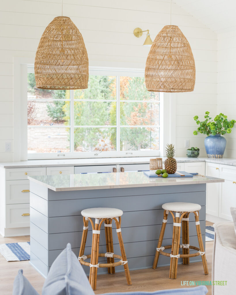
POOL HOUSE KITCHEN & BAR SOURCES: Basket Pendant Lights | Aged Brass Star Sconces | Striped Runner Rug | Backless Counter Stools | Cabinet Ball Knobs | Drawer Bin Pulls | Beverage Fridges | LVP Floors | Blue Serving Board | Seagrass-Wrapped Glasses | Seaglass Bowl | Faux Viburnum Stems | Blue Vase | Cabinet Colors: BM Simply White (perimeter) & BM Santorini Blue (island) | Countertops: White Macaubas Quartzite
Benjamin Moore Smoke
Benjamin Moore Smoke is another gorgeous blue-gray paint option that has light green undertones. Benjamin moore specifcially describes it as a versatile medium gray softened with attractive blue-green undertones
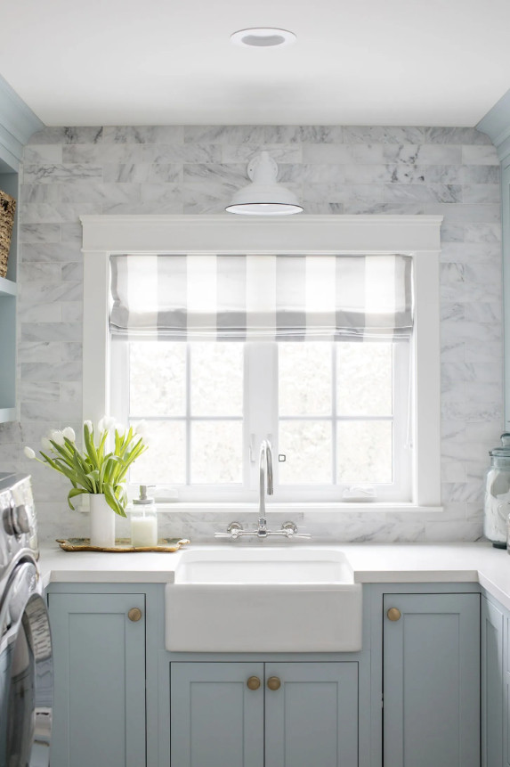
Benjamin Moore Cloudy Sky
These laundry room cabinets painted in Benjamin Moore Cloudy Sky couldn’t be dreamier!
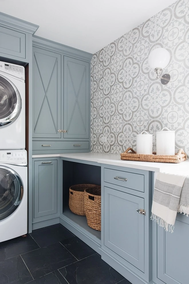
Are you a fan of this color tone? I can’t get enough of it lately!
How to Organize Your Paint Colors
If you frequently paint your home like I do, it can sometimes difficult to keep all your colors (and paint cans) organized! I recently created this free download that I think you will all love!
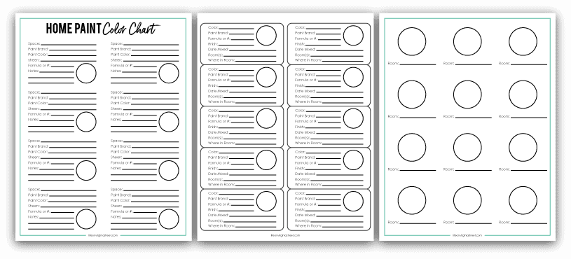
Here’s how I use each of the pages:
- Page 1 – I print on white cardstock to complete and keep handy around our home or near where we store our paint.
- Page 2 – I print on these labels and add them to the paint cans for easy identification.
- Page 3 – I shrink to fit on an index card to keep in my purse, or print as is and fold up to carry with me at all times. I simply add a drop of paint and the room name.
Simply complete the form below and I’ll email the PDF files over to you to start using today!
Additional Paint Color Inspiration
If you’re looking for even more ideas, be sure to check out my post on light blue gray paint color ideas! It’s full of options that look a bit lighter than the examples shown above! Be sure to check out these other paint color posts by clicking on their titles below:
- The Best Blue Green Paint Colors
- The Best Navy Blue Paint Colors
- The Best Coastal Paint Colors
- The Best Black Paint Colors
- The Best Brown Paint Colors
- The Best Green Paint Colors
- The Best Warm Gray Paint Colors
- The Best Gray Paint Colors
- The Best White Paint Colors for Interiors
- The Best White Paint Colors of Exteriors
- Benjamin Moore Hale Navy
- Whole House Paint Colors & Printable Paint Color Organizers
- How To Pick the Perfect Paint Color and My Top Five Neutral Paint Picks
- Paint Colors In Our Home (and Every Color We’ve Ever Used)
I hope you all have a wonderful weekend!
If you would like to follow along on more of my home decor, DIY, lifestyle, travel and other posts, I’d love to have you join me on any of the below channels:

Hey Sarah! Thanks so much for this helpful post and the reference back to your painting process. Do you add Floetrol to the paint at all or did you have any issues with brush marks (assuming you used a brush for the more detailed areas)?
When I use a semi-gloss paint, I usually will use Floetrol if I’m painting with a brush. However, Benjamin Moore now has a line where I don’t even add Floetrol (it’s self-leveling paint so essentially has it built in). That line is just called Benjamin Moore Advance 🙂 It’s what I used to paint our powder bath cabinets and a lot of the trim I’ve painted recently. I hope that helps!
How much floetrol would you add to a gallon of paint? Thanks!
Ahhhh your entryway is gorgeous! Like you, I really love most of the colors you shared and I don’t think any of the options would be poor choices! Question about the upkeep of your entryway rug. I’m scared to pull the trigger on anything that isn’t dark because of muddy shoes…we live in the Midwest, so like Omaha, there’s always rain, snow or mud. I want my guests to wipe their feet off on the rug, but I don’t want to replace the rug all the time. How do you suggest cleaning these indoor/outdoor rugs? Power wash? A regular hose and dish soap?
Hi Kara! Sorry I missed your comment before. On the rug, you can literally just take it outside and house it off! Ours got mud on it recently and clean-up was a breeze. You can definitely use dish soap on it too, but I’ve never needed to yet. They’re made of recycled water bottles (but don’t feel super plastic-y). I read on their site that you can even use bleach on them if you have to!
Just wanted to give you a shout-out that I love your style and enjoy looking at your blog- especially as a fellow Omahan. I am thinking I need to try one of these gorgeous paint colors in my home.
Gorgeous colors and I love how one room looks beautifully into the next. Love it! ❤️
The perfect refresh to welcome spring! Great choice! Love the new rug too.
http://www.paperandvine.com
Beautiful! Where can I find the wallpaper in your bathroom?
Hi! I’m in love with the white sliding doors going into your office. Can you share where you got the doors and the track system please? Thanks!!!
Thank you! Unfortunately we’re the second owners of the home so I don’t have any info on the doors. However, I believe the builder had them custom made.
Very pretty! What color is your white trim in the entry?
Thank you! The trim color is Benjamin Moore Simply White 🙂
Beautiful! What is the color on your walls in the entry way?
Thank you! It’s Benjamin Moore Simply White.
Hi Sarah!
Like so many others, I love your home! I am wondering about your lemon tree though. Did it come in that pot or did you switch it out? Your pot is so much prettier than the terracotta ones they now sell them in and I am wondering if I could switch it out or if that would ruin the tree?
Thanks Jenn! I actually just set it (with the terra cotta pot) inside of a pot I found in the clearance section at Pottery Barn. I didn’t have to re-pot or anything. Many of their other post are made to fit the base ones so there isn’t much work involved. I did the same with our topiaries on our mantle last summer and some cute blue and white patterned ones I found there (although now I just have them as the terra cotta version). I hope that helps!
Hi! I was curious how you did the tile wall in the laundry room. Is it actual tile, wallpaper, etc.
Thanks!
That image is not from my home. I have the designer’s info linked below the image. Thanks!
The wall in the laundry room…are those tiles or wallpaper or something else? I love it!
That image is not from my home. I have the designer’s info linked below the image. Thanks!
I’m in the middle of a laundry room remodel and I love your wallpaper. Could you share what the name of the wallpaper is in the laundry room?
Thank you!
That image is not from my home. I have the designer’s info linked below the image. Thanks!
Where can I find the tile in the laundry room please.
Unfortunately I didn’t design that space but the image is linked to the designer who did. They may be able to help 🙂
Hi! Where did you get your door? Or, did it come with the house? We don’t have the side window panels but have one above the door and I love the idea of taking that out and getting a door that is taller to make it more grand!
Unfortunately it was here when we moved in so I’m not sure. But I think it was custom. The only issue we’ve had is that since it’s solid wood, the top has warped quite a bit, which is why we have to have that extra bolt at the top. I hope that helps!
Can you tell me where you got the white glass sliding door in the foyer?
Our builder actually had it custom made. Sorry!
Hi Sarah.
Beautiful entryway. Just curious on the lighting. I like how simply white look in your photos. Would you mind sharing the lighting -direction in the area. I want to use simply white but is afraid of the yellow undertone. What do you think?
Thanks.
Thank you! This area has lighting for all different directions. The stairwell has west/north/east and the office off to the side has north and south. The hallway opposite the door has west light. So it’s a bit all over the board! The yellow undertone works well in our home because we have so many windows and helps to keep everything from looking to stark. I hope that helps!
Hi. I’m looking for information on the wallpaper used in the laundry room! I love the paint and wallpaper color combo! You have great style! Please share ASAP:)
Brooklyn ❤️
Ben Moore is overrrated. I’m a farrow & ball fan myself. Their paint is easy to work with and you can’t beat the saturation.
Do you know what type/color your kitchen countertops are?
They are Caesarstone Calacatta Nuvo. Hope that helps!
I love your style! Where did you find your front door? I love the windows at the top like that. Gorgeous!!!
Thank you! We’re the second owners of the home so unfortunately I don’t have the info on it. But I believe the prior owners had it custom made.
That is not Providence Blue on the kitchen island?
Yes, it’s 100% Providence Blue. But keep in mind this room gets light from 3 (almost four) different directions so it may look different in different spaces 🙂
Hi !
We just renovated our Master Bath with booth bay cabinets. The bathroom faces east and has a lot of sun throughout the day. Can you recommend a paint color for the walls? The counter is Carter’s marble, floor is Calcutta tile and shower is hand cut subway tile. Thank you! Tina
Hi Sarah… I’m from Brazil and I wanna paint my bedroom so much!! I lived your post and tips! I’m obsessed in all this shades of gray, blue and green! Could you post ou send me some picture in a real house painted with the color smoke? Thanks.
Hi Leandra! I’m so glad you found them helpful! Unfortunately I don’t have any pictures to share with that color, but you may be able to find some on Houzz!
I absolutely love Benjamin Moore paint and the Advance line is fantastic! The high gloss in that line can be used for interior and exterior. I used there ScuffX line for my walls bc they’re scuff resistant and scrubbable and I have kids and dogs so I need all the help I can get lol. I recently discovered that they have a semi gloss in the ScuffX line that is also chip resistant so I use that for my trim now. However, for my cabinets and furniture, I always use Advance.
Love the Providence blue cabinets for bottom kitchen cabinets. I’d do the uppers in white. I have one wall in the adjacent living room that I would like to have in a shade of blue to tie it in. What color blue would you do?
Honestly it’s hard to give blanket advice, as it really depends on the specific lighting conditions and furnishings/floorings in your home. I would recommend grabbing a few samples from this list and look at them in the space at various times throughout the day. I hope that helps!
I don’t think you tried Sherwin Williams’s Krypton or it would of made your list. It’s a gorgeous blue gray. It looks very gray fresh out of the can but the blue comes out as soon as it hits the wall, door etc. Give it a try..you won’t be disappointed.
I didn’t try that one! Thanks for the recommendation!
You used a sample pot to paint the inside of the front door? I thought thought that was just craft paint?
Yes! I’m not sure what it consists of, but that’s what I used (from the Benjamin Moore store) and it’s held up perfectly find for the past two and a half years!
I’m not sure if you answered this or not, but what color is the front door? So pretty!
Oops, I found it!! Waters Edge, love it!
I love your entryway! It is beautiful. I’m wondering what size the rug is? Thank you so much 🙂
I love the wallpaper in your laundry room. Where did you purchase and what is the name of it ease?
I want to redo my kitchen. I want to do a dark gray on my bottom cabinets..white uppers and a blue gray wall color. Do you have any suggestions for me.
Benjamin Moore says that Van Courtland Blue and Water’s Edge are the same formula, FYI 🙂
Hi, yes! I have since discovered that too since this was published. I guess I really like the color since I picked it twice on accident 😉
Is the kitchen cabinetry really in BM providence blue. When I look at the same, it looks much darker and not as bright.
Yes, that is the correct color. Our kitchen just gets a LOT of natural light from nearly every direction. I would try Waters Edge if you are working with a darker room.
Hi Sarah ! Thank you ! I love this color waters edge for my front interior door ! My whole house is silver strand , do you think this would look ok with silver strand ? Thank you!
I think that could definitely work! I’d still recommend getting a sample though to see how it works together in your home’s natural lighting.
Hi! Thanks for this post!! what white color is your stairway banister? It appears bluer/cooler than Simply White, but perhaps it’s just Simply White with a different light hitting it? Could you let me know? Thank you!
-Julietta
Hi! It’s also Simply White but in a semi-gloss finish so it definitely reflected more light than the eggshell walls. I hope that helps!