Sharing details on the best brown paint colors in all tones and shades! Also includes examples of each color in a real-life home setting.
This post contains affiliate links for your shopping convenience. You can read my full disclosure policy here.
If you read my post on my 2023 design trends predictions, I mentioned that I think we’re still going to be seeing a lot of neutrals this year. But one trend I mentioned is the return of warm and deeper neutrals, specifically brown tones! While brown doesn’t necessarily scream “coastal” like my typical decor, I’ve actually used more than half of the paint colors in this post over the years! I’ve always preferred using shades of brown over grays and blacks, so I’m happy to see the trend circling back around again! Today I’m sharing my top picks for the best brown paint colors, and sharing real-life examples of each choice in a real home.
The Best Brown Paint Colors & Real-Life Examples
As you search for the perfect shade of brown paint, I’ve recently found a company that makes the sample process much easier. If you’re wanting to try large, pre-painted samples, I’d definitely look into Samplize for picking the perfect brown paint color for your home! Their large peel and stick samples are made with real paint (not dyed to mimic the color) so it can definitely help narrow down your top picks. I love that you can safely adhere them to your walls, and they’re easily removable and reusable! I’ve collected quite the stack and refer to them frequently!
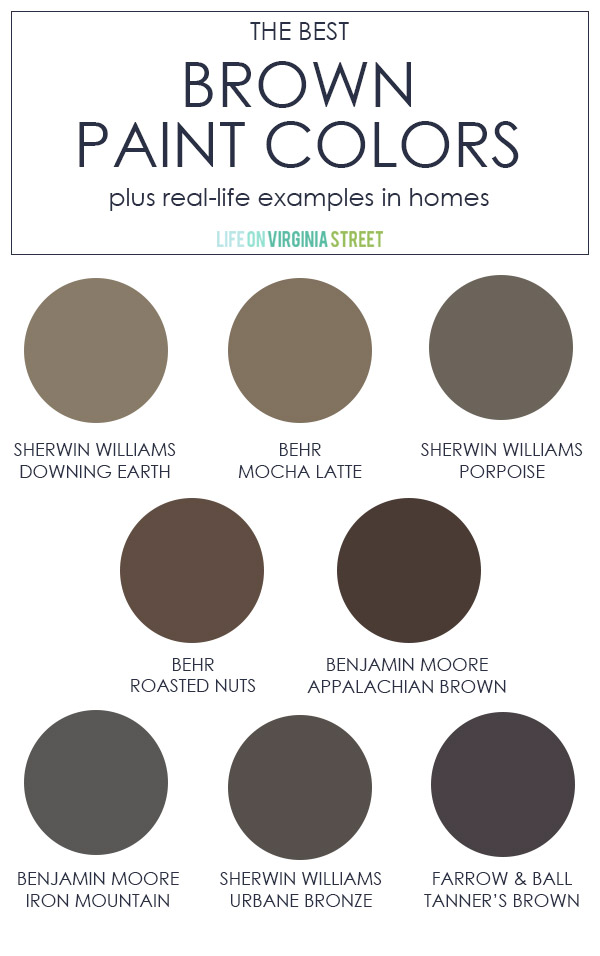
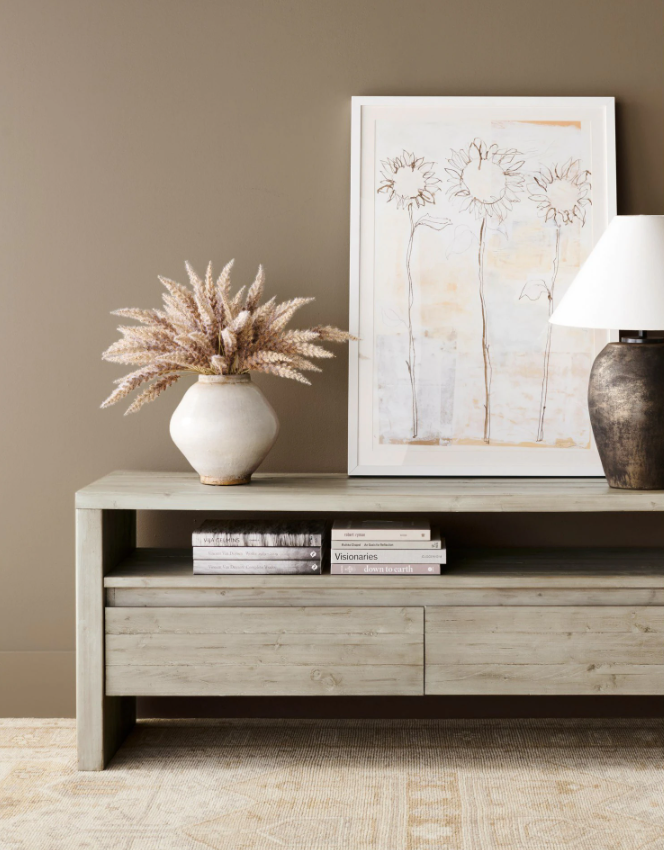
Sherwin Williams Downing Earth
Chosen by Pottery Barn as one of their color inspirations for the year, Sherwin Williams Downing Earth is a mid-tone brown that complements both warm and cool decor palettes.
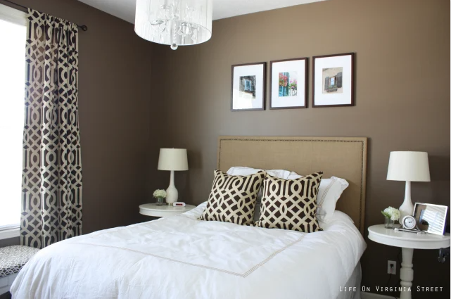
Behr Mocha Latte
I used Behr Mocha Latte many years ago, and it’s still one of my favorite shades of brown! Admittedly, at the time, I was drawn to it by the name. I think my car was painted a similarly named color and it felt like fate. But I loved this little guest bedroom we had back when we really did live on Virginia Street!
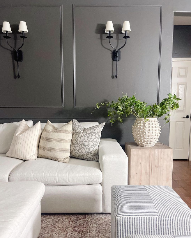
Sherwin Williams Porpoise
Sherwin Williams Porpoise is a dreamy, dark gray bronze that is the perfect neutral for a bold and luxurious accent wall.
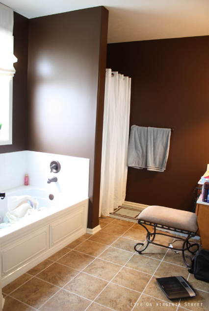
Behr Roasted Nuts
If you’re looking for a warmer brown color, Behr Roasted Nuts may be a good solution with orange undertones! We used this in our bathroom a few homes ago, and loved the rich warmth it added to the space! Sadly, this is the only photo I have of the space shortly after I finished painting it. But I think it gives a good representation of the color!
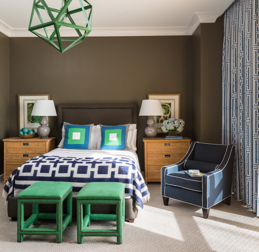
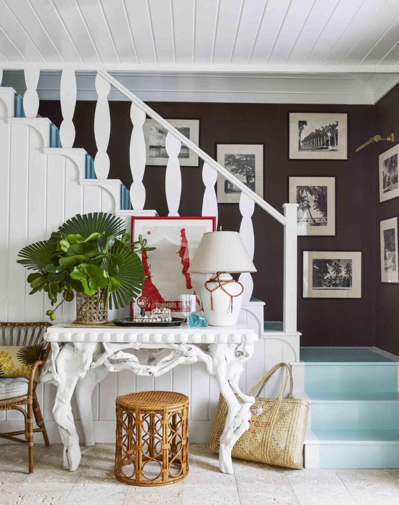
Benjamin Moore Appalachian Brown
Benjamin Moore describes Appalachian Brown as a deep chocolate brown infused with a hint of raisin. In the Harbor Island cottage shown below, this dark brown pairs beautifully white crisp white and coastal blues! The painted “stair runner” is Benjamin Moore Maritime Blue.
Benjamin Moore Iron Mountain
This use-anywhere shade of soft black with rich undertones that complement both warm and cool color schemes. With the warmth added to this black tone, it reads like a grayish brown in most spaces, so it’s a great chameleon color!
This is also the trim and accent color we chose when we painted our Omaha Home White Dove. It most closely matched our Pella bronze window frames!
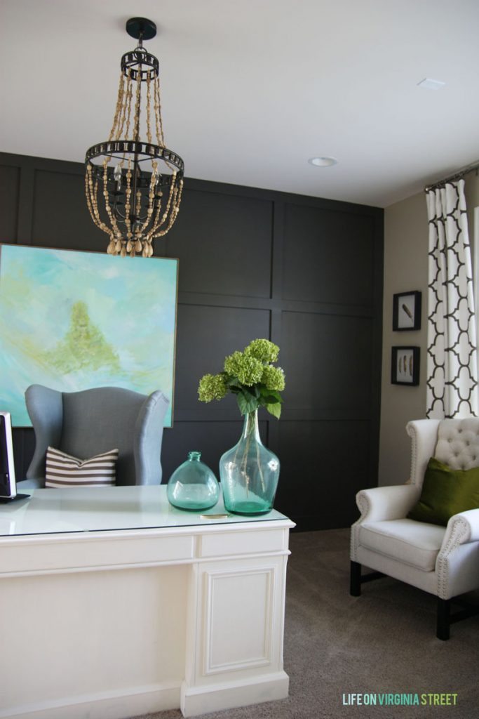
Sherwin Williams Urbane Bronze
Sherwin Williams Urbane Bronze is probably one of my all-time favorite paint colors of any shade! Although technically another gray with lots of warmth added, it definitely feels brown in many spaces! According to Sherwin Williams, the color is rooted in nature, and this brownish gray evokes a down-to-earth tranquility and a subtle sophistication that is hard to beat. It also happened to be the 2021 Sherwin Williams color of the year.
How many of you were here back when I painted our office this color after we created a board and batten grid wall? It’s probably one of the images that helped give my blog some traction back in the day! My styling and photography could have used some help, but I still love this office so much!
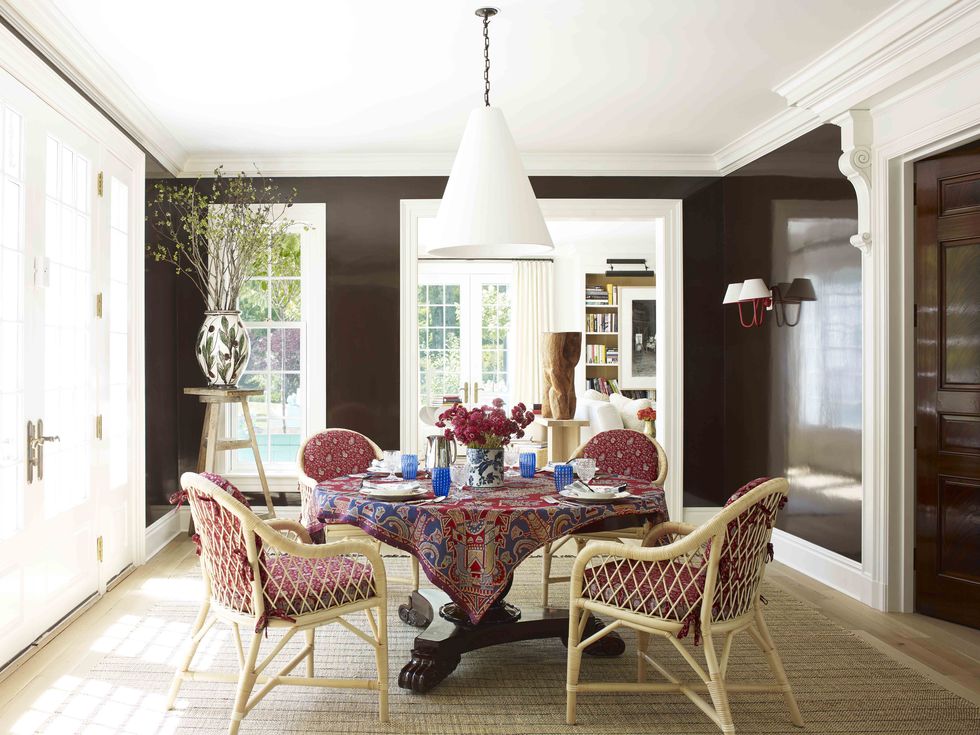
Farrow & Ball Tanner’s Brown
This dark drab hue becomes browner in color within well-lit homes and exteriors due to its warm red undertones. Named after the craftsmen who tan the hides and skins used to create leather, Tanner’s Brown will read as almost black in lower lighting. In the dining room below, this deep and rich color looks slightly lighter, thanks to high-gloss walls that reflect the light.
Additional Paint Color Inspiration
If you’re looking for even more paint color inspiration, be sure to check out these other posts by clicking on their titles below:
- The Best Warm Gray Paint Colors
- The Best Gray Paint Colors
- The Best Black Paint Colors
- The Best Blue Gray Paint Colors
- The Best Blue Green Paint Colors
- The Best Green Paint Colors
- The Best Navy Blue Paint Colors
- The Best White Paint Colors for Interiors
- The Best Exterior White Paint Colors
- Whole House Paint Colors & Printable Paint Color Organizers
- How To Pick the Perfect Paint Color and My Top Five Neutral Paint Picks
- Paint Colors In Our Home (and Every Color We’ve Ever Used)
Free Paint Color Organization Printables
If you frequently paint your home like I do, it can sometimes be difficult to keep all your colors (and paint cans) organized! I recently created a free paint color organization printable set that I think you will all love!
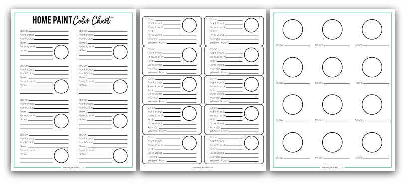
Simply complete the form below and I’ll email the PDF files over to you to start using today! It will also subscribe you to my email list, but you can easily unsubscribe at any time if that isn’t your thing.
I hope you found these ideas and the best brown paint colors helpful! Any other colors you’re on the hunt for?
If you would like to follow along on more of my home decor, DIY, lifestyle, travel and other posts, I’d love to have you join me on any of the below channels:
Instagram | Facebook | Pinterest | LTK
disclosure: some affiliate links used
Another brown I love that I’ve used in many homes is Benjamin Moore Pismo Dunes. Such a pretty color! I used it in my bedroom several times. Thanks for all the color options and pictures!
Thank you so much for sharing! I’ll definitely check it out!
This past fall, my husband and I painted our master bedroom Sherwin Williams Fired Earth. It’s the perfect warm black/brown for a low-light room. I tried warm whites, bright whites, and even a lighter green, but none of them made the room pop or feel cozy. Fired Earth is perfect! We love it!
Thank you for sharing! That sounds beautiful!