Sharing our master bedroom with Sherwin Williams Sea Salt paint on the walls. It gives a lovely, serene, and calm vibe to the room!
It’s an exciting day around here! Today I’m revealing our master bedroom painted in beautiful Sherwin Williams Sea Salt!
This may go down in history as one of my most productive weekends ever. If you follow me on Instagram you probably couldn’t keep up with all things I was doing. Even I couldn’t focus! But, I powered through and the new Sea Salt color is up on the walls!
This post contains affiliate links for your shopping convenience. You can read my full disclosure policy here.
Sherwin Williams Sea Salt Color Pairings
Although I finished the Sea Salt paint, it is very apparent I still have to paint the trim, doors and ceiling. A helpful tip with the pretty Sea Salt color is that if you don’t have bright white trim, almond toned trims really makes the wall color look much brighter/baby blue that it is. To be more happy with the color, you’ll likely want to also paint your trim, or perhaps look for a color that works better with your existing trim.
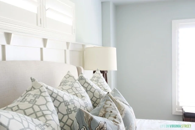
In the photo below, you can see that compared to our almond-toned ceiling, the color looks extremely different and more saturated. However, against our board and batten (painted Behr Swiss Coffee), it’s a much cleaner and natural look! It looks even better with a brighter white. See my post on the best interior white paint colors for several ideas!
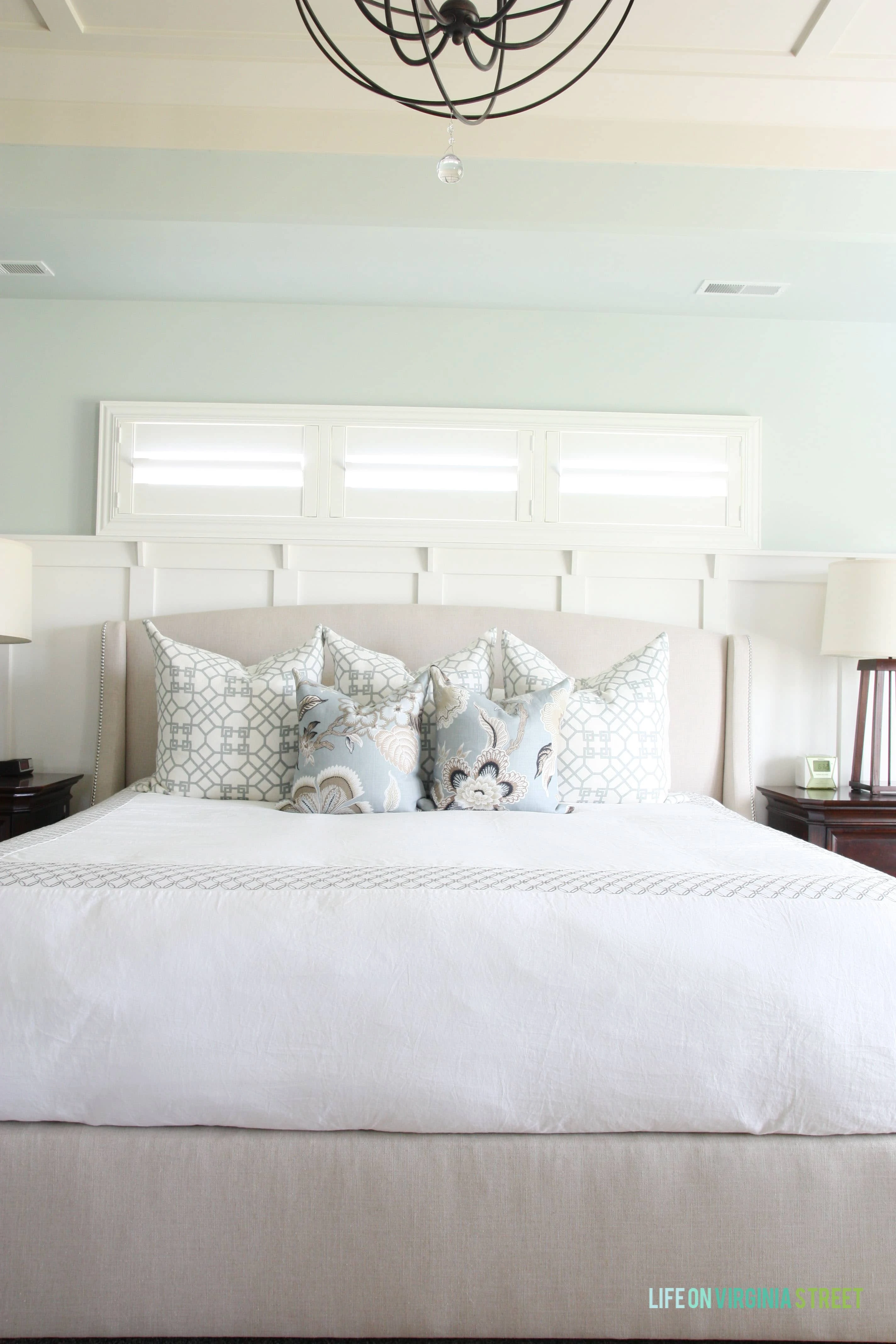
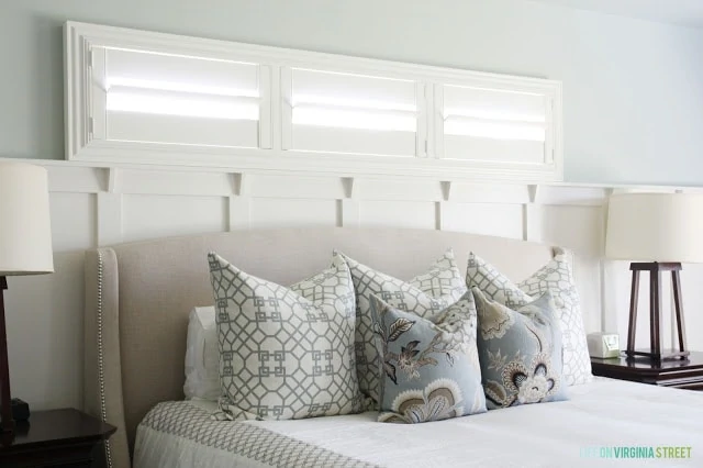
The Sea Salt Color In Real Life
The first picture below is the most accurate of the wall color – and that’s because I painted the board and batten white (Behr Swiss Coffee). It makes the Sea Salt color look much more true and a good grayish-blue paint color. However, in areas where our trim is still almond-toned, it makes the paint look like a pretty bright baby blue in certain lights!
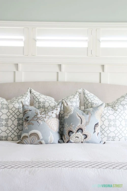
Here are some sneak peaks of how the Sea Salt walls look currently. I’m also sharing all sources for the room at the end of the post. For details on the pillows I made check out this post.
Helpful tip: if you’re trying to avoid the over-saturation of blue like I have in some areas, try ordering at a lower saturation point. For example, you can ask the Sherwin Williams paint counter to only mix the paint at 75% saturation (or any percentage you wish). This will help reduce some of the blue and green tones that can come out strongly in certain lighting situations. I’ve seen examples of rooms at both 50% and 75% saturation levels and they both turned out gorgeous!
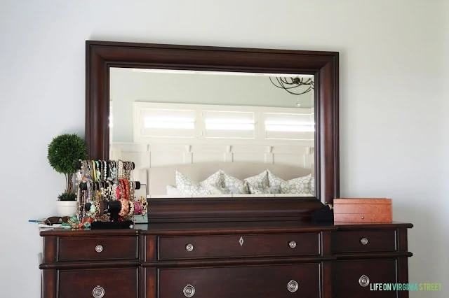
This photo exemplifies how difficult the paint color is to photograph and how the color can change in certain lights. It looks grayish on the wall around the dresser/mirror and yet seafoam green in the reflection – and I don’t feel like either is an accurate representation. Crazy!
Next up, in addition to painting the doors/trim/ceiling, I decided to sew the curtain panels with the fabric I selected. I’m sharing a sneak peek below with just the uncut fabric in the fabric the Euro shams are in (Windsor Smith Pelagos in Mist). I’m so glad to have one less flesh-colored room, and I’m glad I made the choice to go lighter than the Atmospheric that I originally started with!
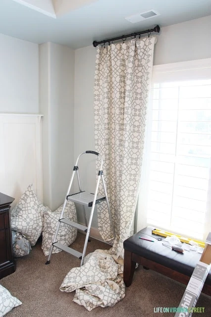
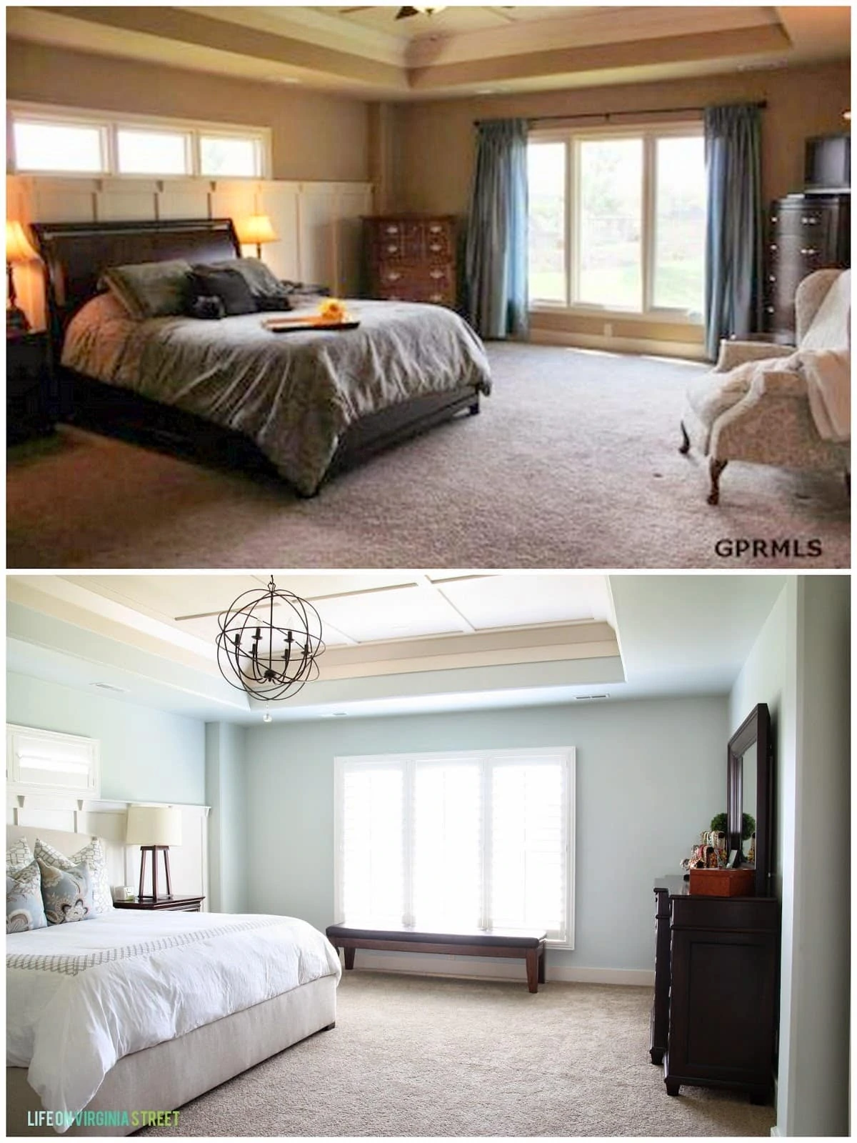
Lots to do but here is the progress so far – a little before and after for you!
MASTER BEDROOM SOURCES: Floral Pillows| Trellis Pillows| Orb Chandelier | Duvet Cover|Lamps|Similar Linen Wing Bed| Similar Bench | Similar Nightstands | Wall Color: Sherwin Williams Sea Salt | Trim Color (fresh paint): Behr Swiss Coffee
If you would like to follow along on more of my home decor, DIY, lifestyle, travel and other posts, I’d love to have you join me on any of the below channels:
looks great!!!! Love the paint color!
Another perfect room. I am so impressed by everything you got done over the weekend.
I love this color it is so peaceful and one that I would definitely love to use myself… Found you through Give Me the Goods Monday….
I have sea salt in four rooms in my house! Your bedroom is gorgeous!
Rita
http://www.ferrytaleshome.blogspot.com
It is looking so beautiful! I can’t wait to see the full reveal! I popped over from Give Me the Goods–thanks for sharing!
~Abby =)
LOVE!!! This is my dream bedroom! So light and bright! You did a beautiful job. Would love for you to share it at the Blog Hop going on now…
http://www.thecasualcraftlete.com/2013/08/18/frugal-crafty-home-blog-hop-36/
Katie @ http://www.thecasualcraftlete.com/
I just wrote a post on this color last week, my FAVORITE for a clean, crisp look that is still soothing! This is gorgeous!!! Absolutely love your layers of detail (woodwork, textiles). In love with this room!!! SO glad you linked up at Give Me the Goods! XO.
I so want my master bedroom to feel like this! Love the colors and how crisp and restful it is looking. Just discovered your blog and can’t wait to see more! Your newest follower, Corey from TinySidekick.com
Love this color! I love a color that tricks you into not really being any one shade! Beautiful room!
I LOVE it. That is one of my favorite colors. And I totally might have to copy you and get some of that fabric for curtains!!
Love love love this color! New follower and I cant wait to see what comes next.
Love the choice of color and all the pictures you got. Those curtains are my fave!
I’m Robin and I’m cohosting Monday Funday this round, so happy to find your beautiful blog! Your bedroom is so peaceful and serene. I love the dark wood against that dreamy blue…and the curtains are delightful! xo
Happy Day~
Robin
All Things Heart and Home
Beautiful bedroom! I love your jewelry organization.
Stephanie @ http://www.thestyledsoul.com
Ahhh, Sea Salt is one of my FAVORITE colors. I actually helped a friend paint her kitchen that color recently. It looks PERFECT in your bedroom!! So glad you shared, it’s beautiful!
Love the new paint color! Thank you for sharing. You are one of the features today at the Make it Pretty Monday party at The Dedicated House. Here is the link to this week’s party. http://thededicatedhouse.blogspot.com/2013/08/make-it-pretty-monday-week-64.html Hope to see you again at the bash! Toodles, Kathryn @TheDedicatedHouse
So beautiful. That is one of my all time favorite fabrics!!!
i want to use that paint color in our master, but i guess it’s the lighting because it looks too turquoise.. love the bedding!
I love how bright yet relaxing your room is! Home run with the paint color and the fabric!
I am a fellow fan of sea salt! It’s in our laundry room & I plan on using it again in our guest bath. It’s such a fesh and soothing color. I love your pillow and drapery fabric. Do you order your fabric from an online source or a local store? I’m so happy I found your blog! I’m your newest subscriber 🙂
Thanks! I order my fabrics all over the place – sometimes online fabric stores that carry designer fabrics as well as eBay and Etsy (I prefer finding remnants here as they are much cheaper)!
I love the colors!! Very beautiful <3
Fotini
Ahhh, Sea Salt is one of my FAVORITE colors. I actually helped a friend paint her kitchen that color recently. It looks PERFECT in your bedroom!! So glad you shared, it’s beautiful!
I just bought this paint a couple weeks ago and it is sitting in our bedroom waiting
for someone to get it done! Thanks for sharing, now I know it will be this weekend. Lovely color and yes it is one of those that can appear a different color depending on the light and surroundings.
Sarah,
I’m in love with the sea salt color. I especially love it with your bedding can you share where the comforter/pillows are from?
Thanks so much
Thank you! I actually made all the pillows, and the duvet cover is from Target. It’s a few years old but I believe they still carry it!
I have been searching for a small decorative curtain rod and can not find it anywhere! Do you happen to remember where it was purchased? also the length?
I believe I got them at HomeGoods. I don’t remember the exact length but basically the smallest they make (I think it’s like 24-48″ rod or something like that). I hope that helps!
Hi, I was wondering if you could tell me where you found the fabric for your pillows and curtains in you master bedroom? Our master bedroom is sea salt as well and I just love the pattern! Is it a darker green? Thanks so much! Julianne
Thanks! I actually made them both. The fabric is Windsor Smith’s Pelagos in Mist. It is really close to the Sea Salt color (maybe just a tad grayer). I think I found the fabric on eBay. I hope that helps!
I love this color, it’s very much reflective of what else is in the room as well as the lighting. And I I thought I was the only one who referred to the taupe revolution as flesh tone!! It’s like every room has a tan, thank heavens for the new natural gray that has character and mood!
Thanks Therese! And I’m glad I’m not the only one that sees flesh 😉
This inspired me to paint our master bath – thank goodness I got the $5 sample of Sea Salt and painted a few spots for lighting. It’s so bright electric baby blue it’s awful. So sad it didn’t work for me. It looks green on the swatch but on the wall it’s a whole ‘nother color. But when you hold up the swatch it still matches it. 🙁 back to the drawing board. It looks gorgeous in this room! (I also got a sample of “geyser steam” – the darkest color on the same swatch – and it’s beautiful for a toilet room nook!)
Yes – it is definitely one of those chameleon colors. I find it looks horrid where my trim is still a really cream/peach color but SO good where it is white. I’ve heard others try this color, but only ask SW to add half the color (just ask for it at 50% intensity). I’ve heard that helps in many spaces too. Good luck!
I’ve been researching sea salt immensley for my kitchen colour as I have used SW rainwashed in my adjoining living and dining rooms, windowpane for ceilings and white for trim, it looks so beautiful, however my kitchen is galley style with a north facing window, so as must to keep things light as the outside has lots of natural shade surrounding our house. This is a great article, but wanted to ask will the 50% saturation, would this help to keep things light?? Love your bedroom it is gorgeous!! Thanks Pat p.s. I have just discovered your site browsing through Kylie’s site!!
I think it would definitely keep things light but would still add a really pretty tint to the walls. I would see if they could at least mix up a sample for you to try out and see if it improves the look at all!
OOps sorry Sara forgot to proofread my comment? LOL!
So beautiful!! How much percentage of sea salt is it?? 🙂
It’s 100% / regular formula 🙂
Hi. Love the board & batten with shelf behind the bed. Do you have a blog post “how to” on this wall treatment? If so, please post the link. thanks.
This one was actually done by our builder. However, I do have a tutorial for board and batten in a grid format that would be fairly similar if you’re interested. Many of the same steps/tips could be applied. Here’s the link: https://lifeonvirginiastreet.com/2013/07/tutorial-board-and-batten-grid-html/
Sea salt is in my master bedroom and I LOVE it! Looks so great here too.
Thank you so much! It really is a beautiful color.
Your master is amazing! I recently painted our master in Sea Salt and am loving it ( Also used in a bathroom in previous home). Would you mind sharing the color of the rug your chose?
Looks great! Did you use satin or flat in sea salt? Thank you
Thank you! I believe it was an eggshell finish.
Hi My kitchen hasn’t any windows
with cherry brown cabinets.
Is sea spray a great choice thank you