I will guide you through step by step on how to paint a buffalo check wall that is truly eye catching!
This post is sponsored by Dutch Boy® Paints. As always, all thoughts and opinions are my own.
For the past two weeks, I’ve been hinting about a fun new project I’ve been working on, and today is the big reveal! Not only that, I’ll be sharing all the details on how to paint a buffalo check wall. But first, a little history.
Before The Laundry Room Makeover
You may recall that several years back I updated our small laundry room to make it a prettier place to do laundry. Shortly after moving in, this was how the space looked.

The first full makeover resulted in this fun space. It was beautiful and a huge improvement, but it felt more like the design belonged in a nursery or kid’s room than a laundry room.
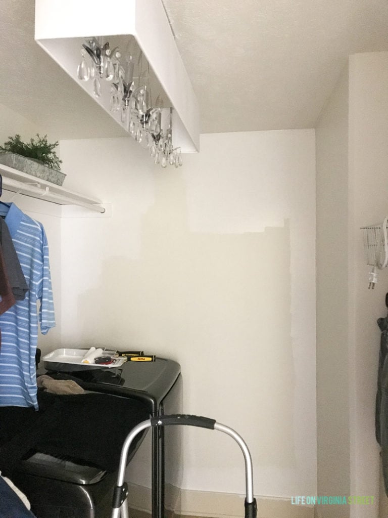
In the spring of 2016, I decided to give the space a ‘makeunder’ of sorts to make it more our style. But the problem was, I never was 100% sure on the direction I wanted to go with the space. So, I made a few updates, but then it basically sat unfinished and completely boring. And it honestly looked a bit pink with the not-quite-white walls and lighting.

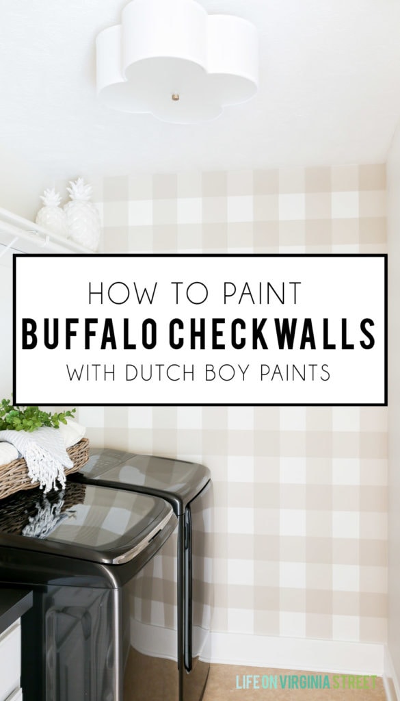
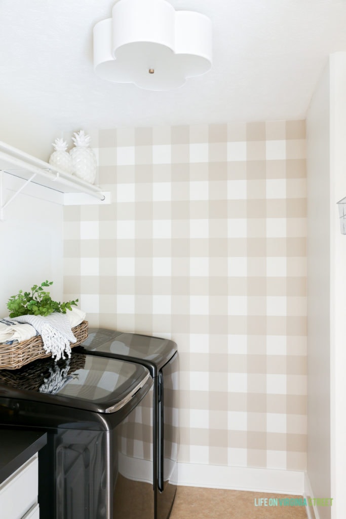
After a few weeks of work, I’m excited to share how the space looks now! I can’t even tell you how much I am obsessed with this beige and white buffalo check wall.
Today I’m going to be sharing the detailed tutorial for painting buffalo check on walls. It’s definitely not hard, but requires patience, precision and does take some time. It is worth it though!
Supplies Needed for Painting a Buffalo Check Wall
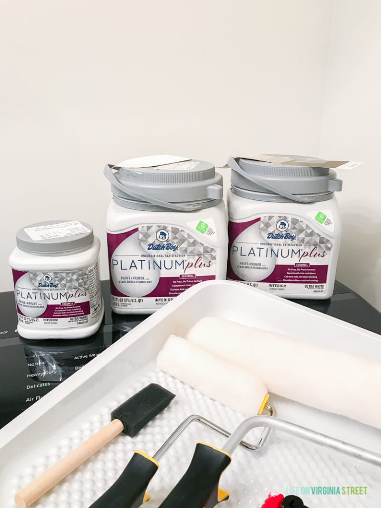
- Three or four shades of paint (I’ll explain more on how you decide later). I used the following shades for the buffalo check:
- Dutch Boy Platinum® Plus Interior Paint + Primer Sandstone Tint (441-2DB) in Eggshell
- Dutch Boy Platinum® Plus Interior Paint + Primer Sandstone Tint (441-2DB) @ 50% saturation in Eggshell
- Dutch Boy Platinum® Plus Interior Paint + Primer Super White (001W) in Eggshell
- Painter’s tape (regular and delicate surface) – I used nearly four rolls for this project but it will depend upon the size of your walls
- A putty knife (or credit card)
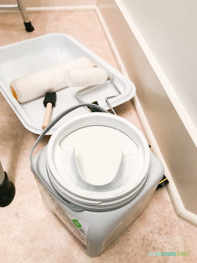
- Paint tray
- A small roller
- A large roller (if you’re painting your entire wall first)
- A level (size will vary depending upon your wall sizes)
- A tape measure
I was able to pick up all of my supplies at my local Menards. I went with Dutch Boy’s Platinum Plus paint line, which is paint and primer in one, and has stain-shield technology. Perfect for spaces like laundry rooms, kitchens and bathrooms! It also helped ensure that all of my pencil lines for this project were easily removable.
How To Paint a Buffalo Check Wall
If you follow these steps closely, you will end up with crisp, beautiful buffalo checks! Please note that I’ve also included a set of time-lapse photos near the end of the post that shows all the steps in order.
Getting Your Measurements Right
Before starting this project, you’ll want to measure the wall you’ll be painting. Try and be as exact as possible in order to ensure proper calculations. I’m going to show you my really rough drawing and calculations so you can see my thought process.
I thrive on symmetry, so I knew I want every box in my pattern to be a “full” box. I wasn’t okay with having 1/4 of a box on any of the edges. With that in mind, I also knew I wanted to start and end on the same color on the sides, or I felt like it would look off. I wasn’t as concerned about this going from the top to bottom (since the baseboards would add to the overall look regardless). This meant I had to have an odd number of boxes width-wise, but I was okay with odd or even top to bottom.
My room was 66.25″ wide and 90.5″ tall. I also measured my baseboards to get a feel for how they would play into the design. They were 5″ above the quarter-round and 5.5″ with the quarter-round. In my mind I was thinking four or five inch squares would be close to the right size based on how busy I wanted the pattern.
Once you have a ballpark idea of how big you want each square, you’re going to have to dust off your calculator!
Since the 5″ square got me closest to where I wanted to end up, I went with that. The numbers weren’t 100% round at 5″, so I split the extra .25″ on the width and made the square on the end 5.125″ wide, and then I added the extra .1″ to the very bottom row of square on the height. In my calculations below, you can see that if I went with 4″ squares, I would have had 16.56 squares running horizontally and 22.625 squares running vertically. The numbers were a bit more complex, and it also would require that much more taping!

The 5″ squares also meant that I could have the odd number of boxes (13) running right to left that I wanted. Since the number running up and down was even (18) I would start on one color and end on another. Which again, I was okay with. I roughly mapped how the colors should look in the image above. I wanted to have color on the side columns (rather than the white boxes) so it helped me map out my taping plan.
Make Your Color Plan
Pick the color you want as your most saturated. In this case, I wanted a warm taupe color that would look good with beige or gray colors alike. I did not want it to look gray, as I felt it may look too modern with our black washer/dryer pair. I turned to Sandstone Tint (411-2DB), the perfect mid-toned neutral color for the space. Since Dutch Boy Paints recently announced this shade as its 2018 Color of the Year, I knew it was a safe bet! I chose it as my saturated color (meaning the darkest spot on my feature wall).
True buffalo check technically has four colors if you look closely. However, I opted to use only three colors since the intensity of my main color (Sandstone Tint) wasn’t crazy dark. If I were going with a navy blue or something else with more contrast, I would have likely done four colors. With that being said, I used Sandstone Tint at 50% saturation for my mid-toned color. Just ask the paint counter to mix accordingly (I would not recommend hand mixing the color in case you need more paint later, which would be too hard to match). If I were doing a fourth color, I likely would have done Sandstone Tint color at 25% intensity.
For my base color, I chose Dutch Boy Paints Super White (001W) to give a much cleaner white look on the walls.
Paint Your Base Color
I started by painting the entire room in Dutch Boy Platinum Plus Interior Paint + Primer Super White in Eggshell. The prior “white” color was actually rather cream, and in a room with no windows, it looked dull and dingy. The fresh coat of bright white paint already improved the space! After applying two coats, I allowed the paint to fully dry before moving to the next step. You can see here in my initial painting just how different the two whites are. I loved the fresh new look of Super White!
Helpful tip: The Dutch Boy Paint line has the most genius cans I’ve seen yet. Not only are they screw top, but they have a built-in pour spout and handle grip, making the process so much cleaner and easier!
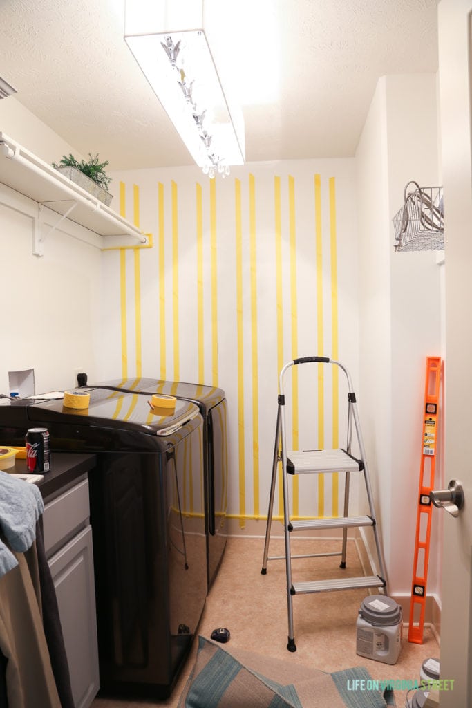
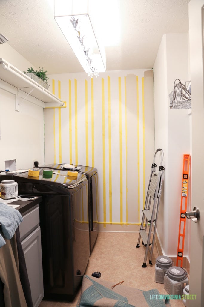
Start Taping Your Lines
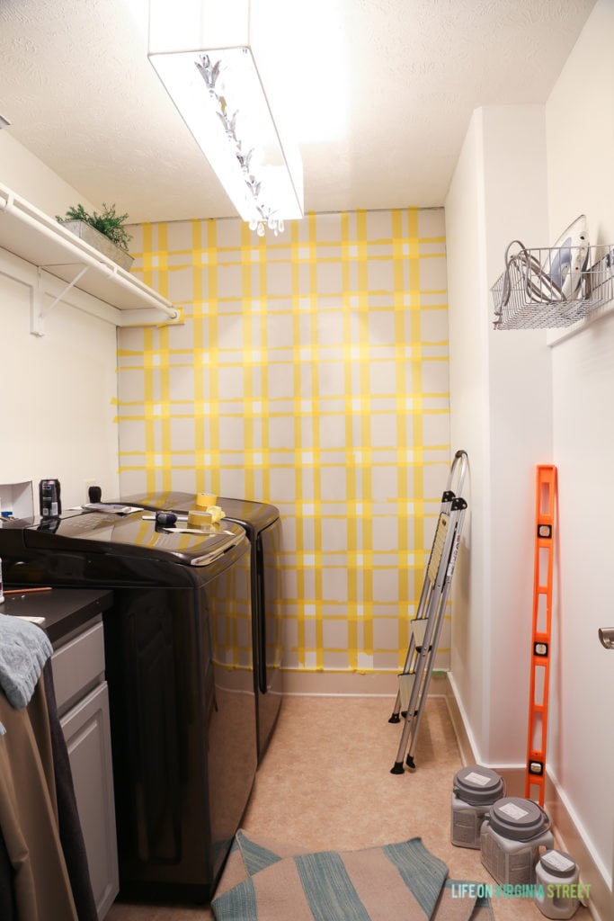
Now begins the most tedious portion of the project: taping your lines. If you’ve never painted stripes before (which is essentially how you start), the lines can play mind games with you. However, this is the most important step to get right, and I can’t emphasize enough how important it is to use your level as you go! This will help ensure a perfect pattern when you’re done and will be well-worth the time spent.
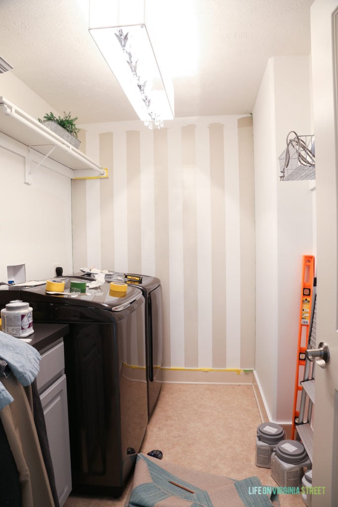
Ignore the horizontal tapeline in this first picture (I removed it once I realized it wasn’t going to work). I started by making tick marks 5″ out from the wall at multiple points on the wall. I then used my four-foot level to draw a pencil line down the length of the wall. I then taped to the left of that line. Keep in mind that most walls aren’t truly straight. So you’ll likely have tick lines that fall outside of your level line. That’s okay! Ignore the outliers, and tape on the most level line you can.

Next, you’ll measure your assigned distance from the right side of your first piece of tape. Make your pencil marks, level and draw your line. This time you’re going to put your tape on the right side of that line. You’ll notice this creates two different size stripes. This is correct even though visually it looks off. You’ll then repeat these steps, going from the right to the left of the pencil line with your tape. Just remember you’re essentially creating the strip for the color (at full-width) while covering your white (or lighter) paint on the inside. Hence the two sizes of stripes. In the example below, which is the second piece of tape I was measuring for in the image above, I measured to the 5″ mark and then placed the left side of the tape on that line.
Always, always, always use your level to draw the pencil lines. I can’t emphasize this enough. I used a little 1-foot level around my shelf, but otherwise stuck with my four-foot level throughout the project.

Helpful tip: When taping, keep your pencil line just slightly on the side of the tape that will get painted! This will minimize any erasing you need to do at the end. In the example below, my paint was going on the right side of this tape, so, rather than overlap the pencil line with the tape, I placed the tape just ever so slightly outside of that pencil line to ensure it would get painted. Makes for much less erasing!

Once all the tape is up, the ratio of your stripes should look similar to the image below (large, small, large, small, etc.). Before moving to the next step, I used a plastic putty knife (a credit card would also work) to rub along all of the tape to ensure a tight seal. I can guarantee that anyone that walks by will swear you taped this off incorrectly.
Helpful tip: Before you finish your last three or four rows, I like to always measure the distance left to the end of the wall. Inevitably, your measurements along the way have been ever so slightly off and as those add up, you don’t want to have your last row be significantly smaller/larger than the others. So, when I had three rows left, I found that I had about an extra .25″ than planned. I basically took that number, and divided it by the number of rows left (in my case three). So, for the next three stripes, rather than make them 5″, I made them 5.083″. I would argue that if you’re only off by less than .25″, visually you’re not to notice it so you could probably leave it. Anything larger, I would try to accommodate the difference.
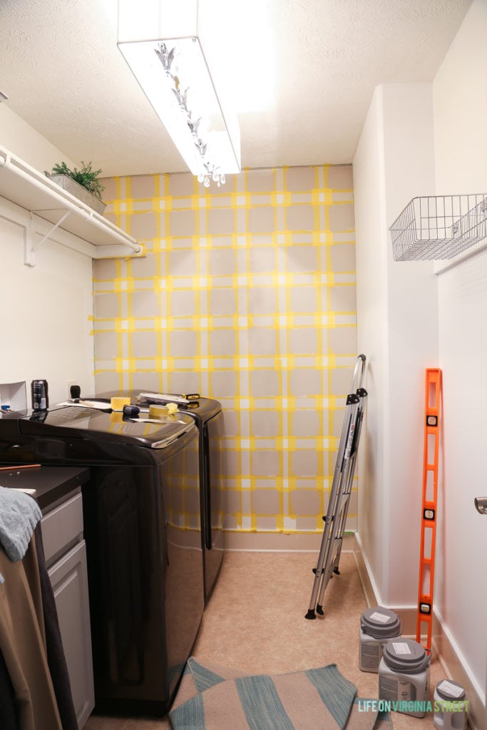
Paint Your First Color
Once your first set of stripes are complete, you’ll start painting with your mid-toned color. In this case, I used Dutch Boy Paint Sandstone Tint at 50% saturation in an eggshell finish. You’ll paint the 5″ sections (not the smaller once that are blocking off the white color. You can see below I did one stripe on the left and two on the right for purposes of showing you which sections to paint.
Helpful tip: Some people will draw ‘x’s in the rows they need to paint so they don’t accidentally paint the wrong row. I didn’t use this method, but feel free to try it if you are nervous about messing up!
I did two coats of paint on all the 5″ stripes, allowing four hours of dry-time between coats per the instructions on the can. After the second coat was painted, I immediately removed the painters tape. I feel like this provides the crispest lines. Just be sure to not get any wet paint on the wall (or to smear your lines you painted). As you can see, as odd as it all looks taped, the stripes are perfectly the same size! In this photo you’ll also notice in the top right-hand corner I painted Sandstone Tint at full saturation to ensure that there was going to be enough contrast. I didn’t want to get through the whole project and realize the colors were off. I loved how it all looked together!
I then allowed the wall to dry for 24 hours.
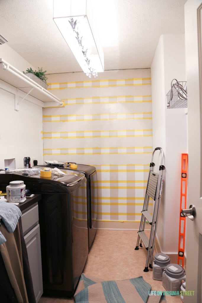
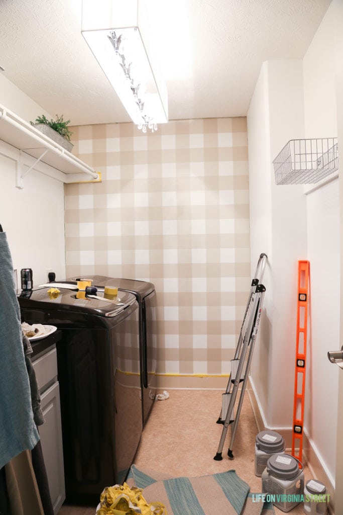
Tape Your Second Set of Lines
Next, you’ll begin taping your horizontal lines. I measured down from the ceiling to mark my 5″ marks. You’ll follow the same process you did with the vertical lines. It’s especially important to level as you go on the first row, as most ceilings are not perfectly even. This will ensure your future stripes are as level as possible too.

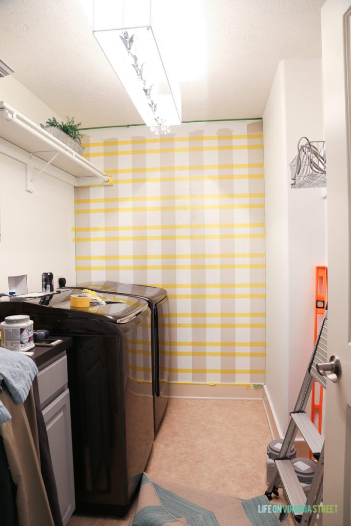
Paint Your Next Set of Lines
I’ll be honest. You’re going to feel like you completely ruined your perfect stripes once you start this step. If you’re only using three colors like I did, you will use the same color of paint that you used in your last step. In my case, I used Sandstone Tint at 50% saturation again. Repeat steps as outlined in the painting step above. This time, do not remove your tape once you are finished. This will save you quite a bit of taping and measuring in the next step.
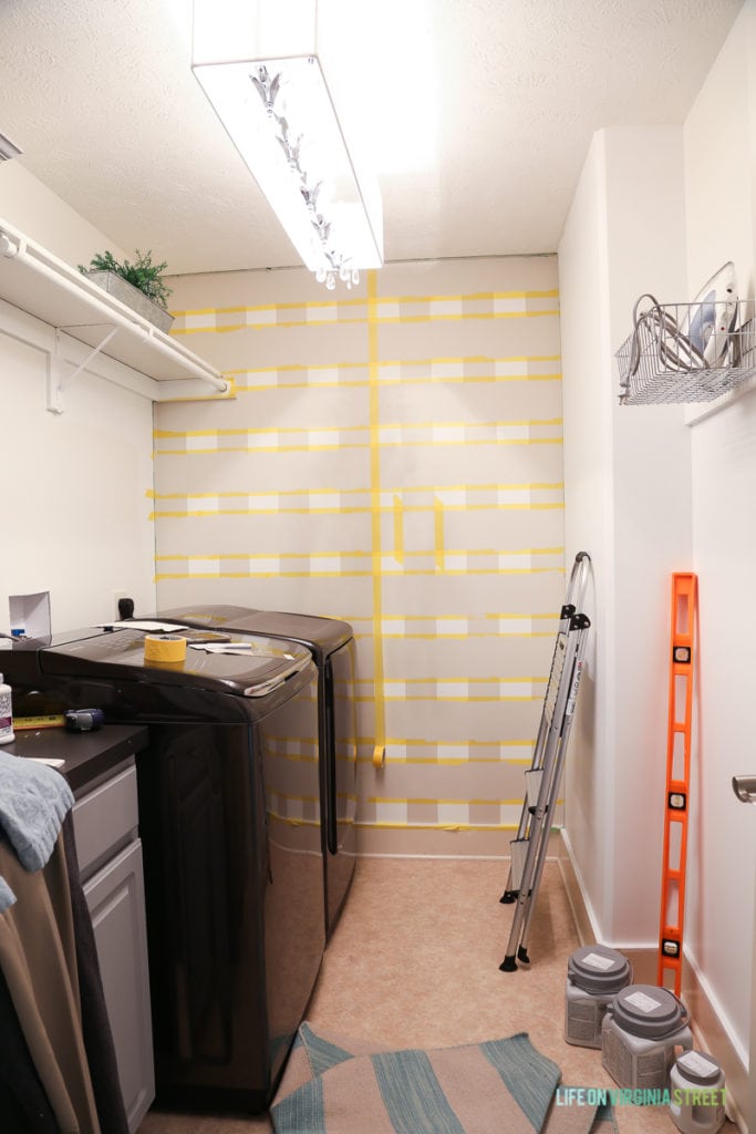
Tape off Your Saturated Squares
Once your second set of stripes has fully dried, you’re ready to begin taping off your saturated squares. Since you left the tape on in the prior step, this is the fastest portion of the painting process. Rather than measure and level as we’ve done in prior steps, this time, you simply use your existing paint lines to finish out the saturated squares. The easiest way to remember where you’re painting in this step is the boxes where the mid-toned colors intersect. I basically got the roll of tape and dropped it from ceiling to baseboard, taping off the straight lines vertically (using my prior painted lines as guides).
Paint Your Saturated Squares
Once everything is fully taped off, you’re ready to begin the last step of the project! Use your dark, saturated color to paint in the squares you taped off. At first, my two colors didn’t look that different, but as they dried, the contrast was noticeable.
I did two coats of the saturated color, and again, removed the tape shortly after painting the second coat. At that point, I actually removed the tape from the entire wall. I was so happy with how it turned out! It’s at this point you realize just how worthwhile all that precise taping, measuring, and painting was!
I then painted the baseboards using Dutch Boy Platinum Plus Interior Paint + Primer Super White (001W) in a semi-gloss finish. I realize this step is likely not needed for most projects. But it made such a huge difference in mine to get rid of the almond trim color!

You’ll likely need to use a pencil eraser in a few areas where the pencil wasn’t painted over. If you used eggshell, or glossier, like I did, clean up should be a breeze!
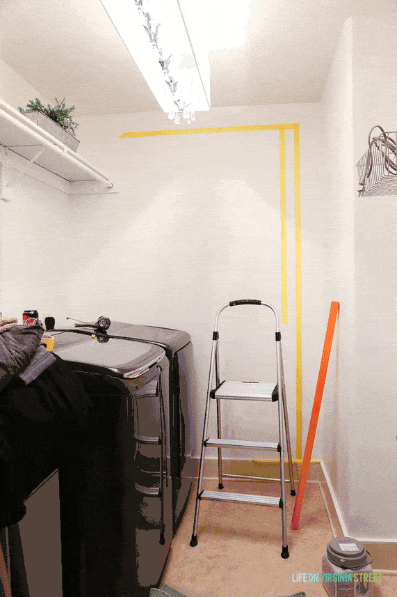
See the Project in Motion – Painting Buffalo Check Walls
I left my tripod and camera in our hallway the whole time I was working on this project. Below you can see the project in motion and all the steps for painting perfect buffalo check walls!
Style and Enjoy!
This wall makes such a major impact in this otherwise boring room and I couldn’t possibly love it more. You’ll note we also opted to get rid of the chandelier we had previously installed. Other than that, I kept the decor really simple to let the walls shine!

Thank you to Dutch Boy Paints for collaborating with me on this space and for inspiring me to finish this space once and for all!
If you would like to follow along on more of my home decor, DIY, lifestyle, travel and other posts, I’d love to have you follow me on any of the following:
A great post! Love the laundry room. Your buffalo checks are perfect. The color is great, not too bold. Terrific transformation. ????
YOU HAVE DEFINITELY INSPIRED ME! MY LAUNDRY ROOM WOULD BE SO MUCH MORE APPEALING WITH A STATEMENT MAKING WALL. YOURS LOOKS AMAZING! HAPPY WEEKEND!
Oh wow, this is gorgeous. I love it and your tutorial is perfect. Now I just need to get busy and so something with my laundry room.
Adorable! Where is the light fixture from?
Thank you! I got it from Wayfair. Here’s the direct affiliate link to it if you’re interested: http://bit.ly/2vACZHW.
Wow, what a difference! It looks great and I love the tan color you chose. The wall really does make the space.
I absolutely love this wall. I would like to recreate it but I can not find Dutch Boy paint. Could you guess a similar color in another brand for Sandstone?