This post is a collection of coastal-inspired whole house paint colors, along with photos of each color in our home. I’ve also included a free set of paint color organization printables so you can keep you own room paint colors organized and easy to reference at all times!
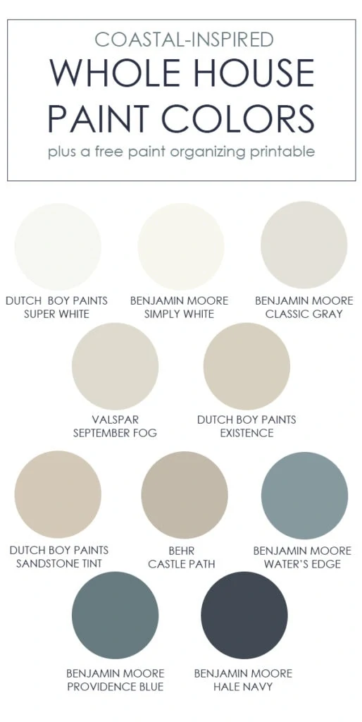
Picking a paint color for rooms in your house can be tough, so I’m not surprised at all that the most frequent questions I get are about paint colors. Although I have every paint color we’ve ever used on this Paint Colors tab, I figured it was time for a fresh update. The list on that page has grown so extensive that it can be a bit hard to navigate at times! Clearly I love changing paint colors! So today, I decided to create a post with all of our current coastal-inspired whole house paint colors on one easy to reference page. Along with that, I’m really excited to share some free paint color organization printables at the end of the post that I hope you find helpful!
This post contains affiliate links for your shopping convenience. Click here to read my full disclosure policy.
Room Paint Colors
I don’t necessarily believe that every paint color in your home has to match, coordinate, or be the same. However, if you’re going for a serene vibe, I also don’t think it hurts to ensure they don’t look jarring next to one another. Over time, I’m also trying to have more consistency in the variation of colors I’m using. This helps keep the flow from room to room, but also helps with paint storage and touch-ups 😉 My printables at the end of this post may help with that, as well.
If you’re wanting to try large, pre-painted samples, I’d definitely look into Samplize for picking the perfect paint colors for your home! Their large peel and stick samples are made with real paint (not dyed to mimic the color) so it can definitely help narrow down your top picks.
Coastal-Inspired Whole House Paint Colors
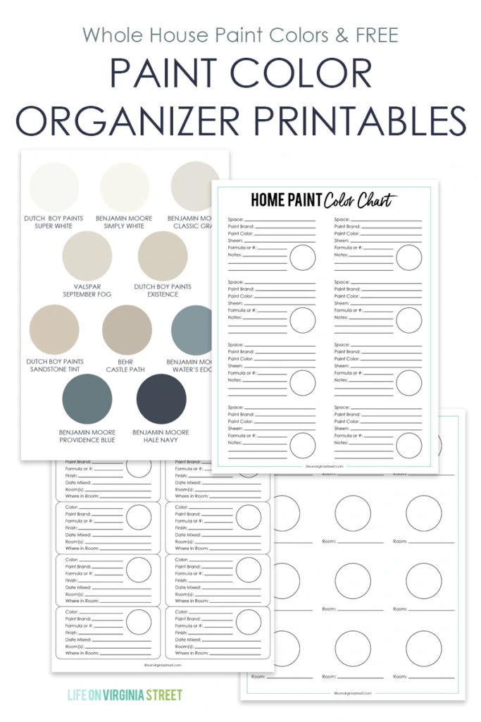
Following are all of the current paint colors in our home. I’m following the order of the graphic shown above, but have lumped a few colors together if they’re in the same room. I love that each of the colors we’ve selected have a slight coastal feel with neutral sand and water tones.
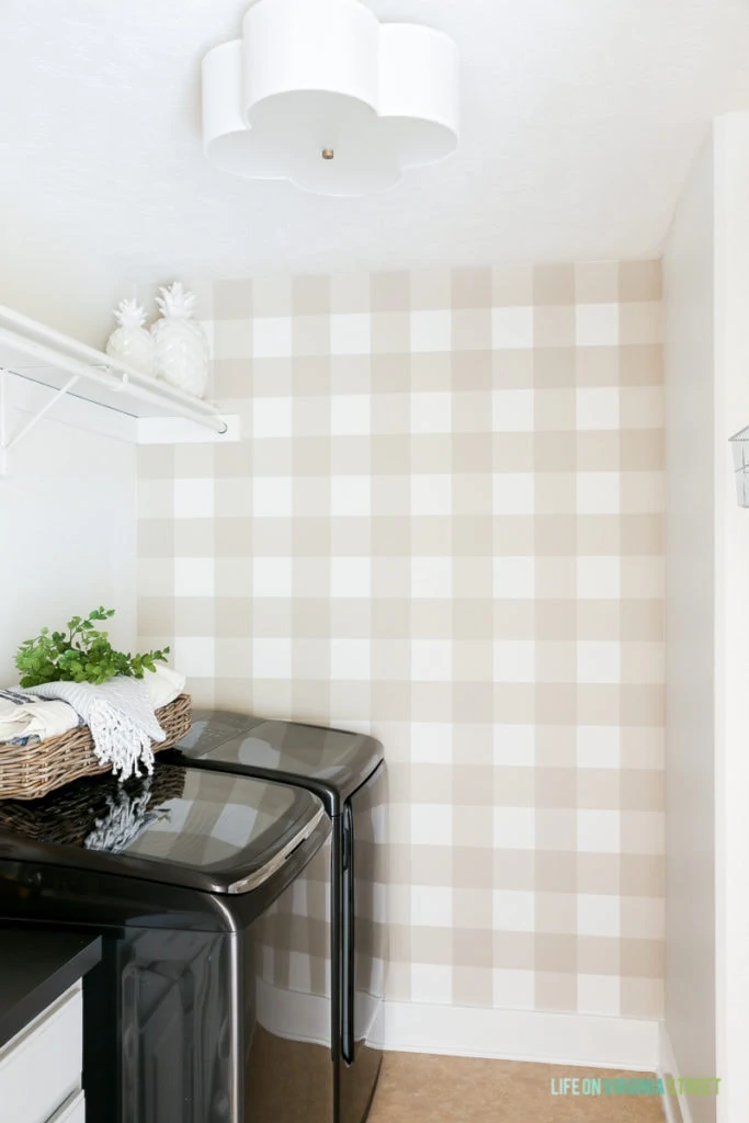
- Dutch Boy Paints Super White & Dutch Boy Paints Sandstone Tint – I used both of these colors (along with the Sandstone Tint at 50% saturation) to create this buffalo check wall in our laundry room. It’s one of my favorite projects ever!
- Benjamin Moore Simply White – Simply White has quickly become the most used paint color in our home. I’ve slowly transitioned all of the trim work to this color, and we now have most of our walls painted this airy warm white color, as well. The only real exceptions are the bedrooms and bathrooms.
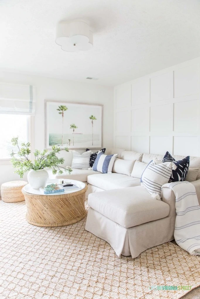
DEN SOURCES: Pottery Barn Sectional | Diamond Jute Rug | Scallop Light Fixture | Coffee Table | Palm Tree Art | Jute Poufs | Similar Ceramic Vase | Faux Greenery Stems | Small Striped Pillow | Wide Striped Pillow | Palm Print Pillow | Striped Throw | Roman Shades
- Benjamin Moore Classic Gray – I love this light, serene, warm gray color because it tends to change in different lighting. We currently have it in our smaller guest bedroom along with a color-matched version in our mudroom, guest bathroom, and master bathroom.
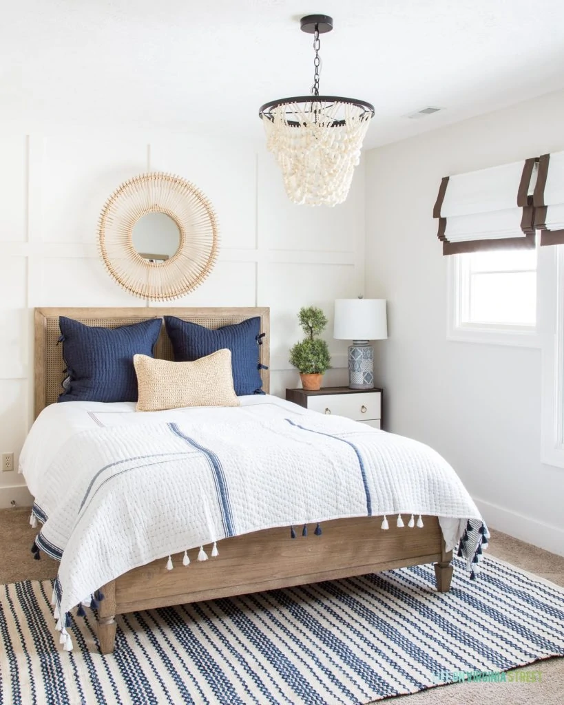
GUEST BEDROOM SOURCES: Cane Bed | Wood Bead Chandelier (this smaller version is no longer available) | Rattan Mirror (similar here) | Tassel Quilt | Pick-Stitch Euro Shams | Topiary | Similar Roman Shades | Rug
- Valspar September Fog – This is my latest favorite neutral. It’s saturated enough to be seen, but also lets the decor be the star. It’s one of those warm, cozy colors that’s perfect for a bedroom or living room when you don’t want stark white. This color creates a soothing space.
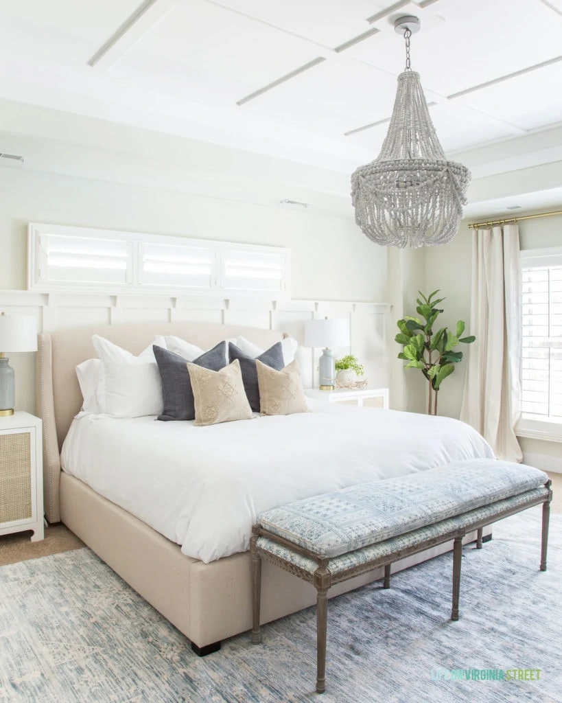
MASTER BEDROOM SOURCES: Similar Bed | Wood Bead Chandelier | Bench | Linen Pillows (color: Gunmetal) | Embroidered Pillows | Striped Curtains | Gold Curtain Rod | Faux Fiddle Leaf Fig Tree | Cane Nightstands | USB Ceramic Lamps | Rug | Decorative Manzanita Branch | Spotted White Vase
- Dutch Boy Paints Existence – This is a really pretty greige color that has both gray and beige properties. Over time (and likely as the rest of our home has gone white), I feel like it’s a bit dark for this room that gets little light. This is one of the few on the list I may change soon, even though I do still love the color itself! Just not in this room.
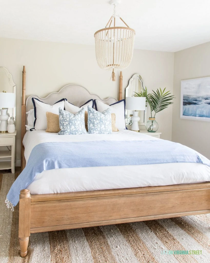
GUEST BEDROOM SOURCES: Bed | Bead Chandelier | Pair of Lamps | Striped Rug | Nightstands | Mirrors | Art | Faux Palms | Floral Pillows | Tassel Blanket
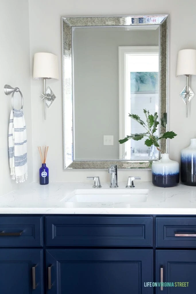
- Behr Castle Path & Benjamin Moore Hale Navy – When we first moved into our home, Castle Path was my go-to color for everything! We had used it in our prior home as well. I still love it, but it’s a bit darker and bolder than the look I want now. However, we do still have it in a few places like our basement stairwell and our powder bath. The cabinets in the bathroom are Benjamin Moore Hale Navy (as is the accent wall in our office). It is truly the best stroke of navy blue paint color!
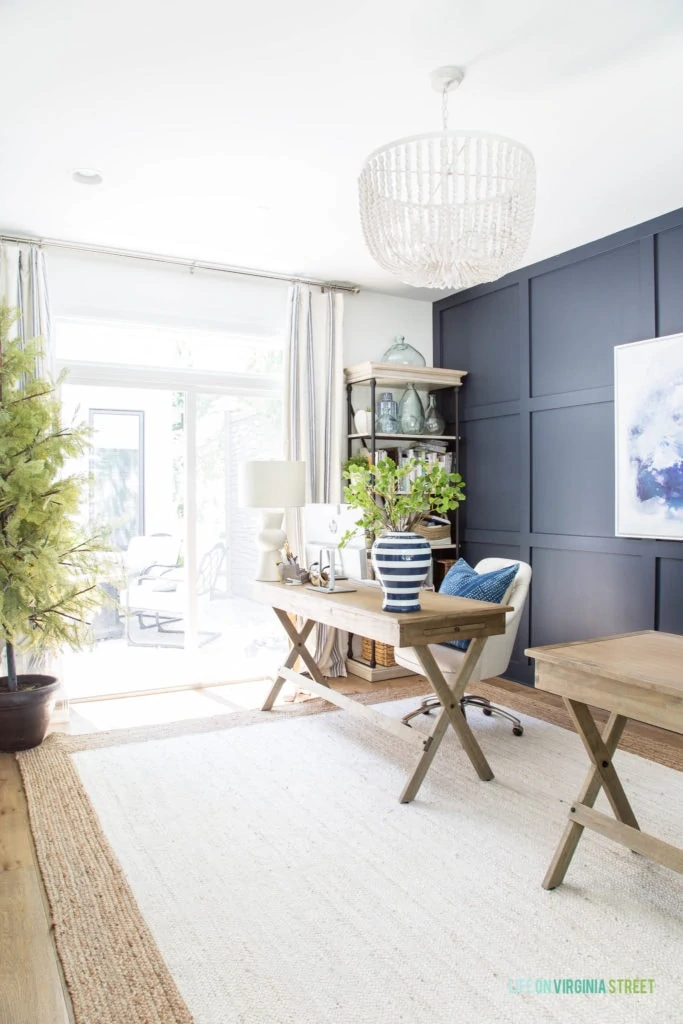
OFFICE SOURCES: Wood Desks | Linen Chairs | Blue Dyed Pillows | Jute Rug | Striped Curtains | Bookcase | White Wood Bead Chandelier | Similar Lamps | Faux Ginkgo Stems | Similar Vase | Abstract Art | Faux Cypress Tree – no longer available
- Benjamin Moore Water’s Edge – This is my favorite serene blue-gray paint color and I absolutely love how it looks on the interior side of our front door!
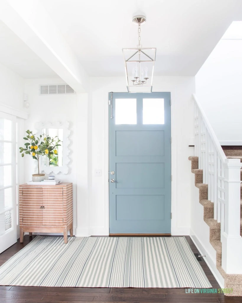
ENTRYWAY SOURCES: Striped Rug | Cabinet | Lantern Pendant Chandelier | Faux Lemon Tree | Mirror | Door Surface Bolt
- Benjamin Moore Providence Blue – This is the color on our kitchen island. It definitely looks lighter in our home because of all the surrounding windows, but I absolutely love the color in all lights! The surrounding walls, trim, and cabinets are all Benjamin Moore Simply White.
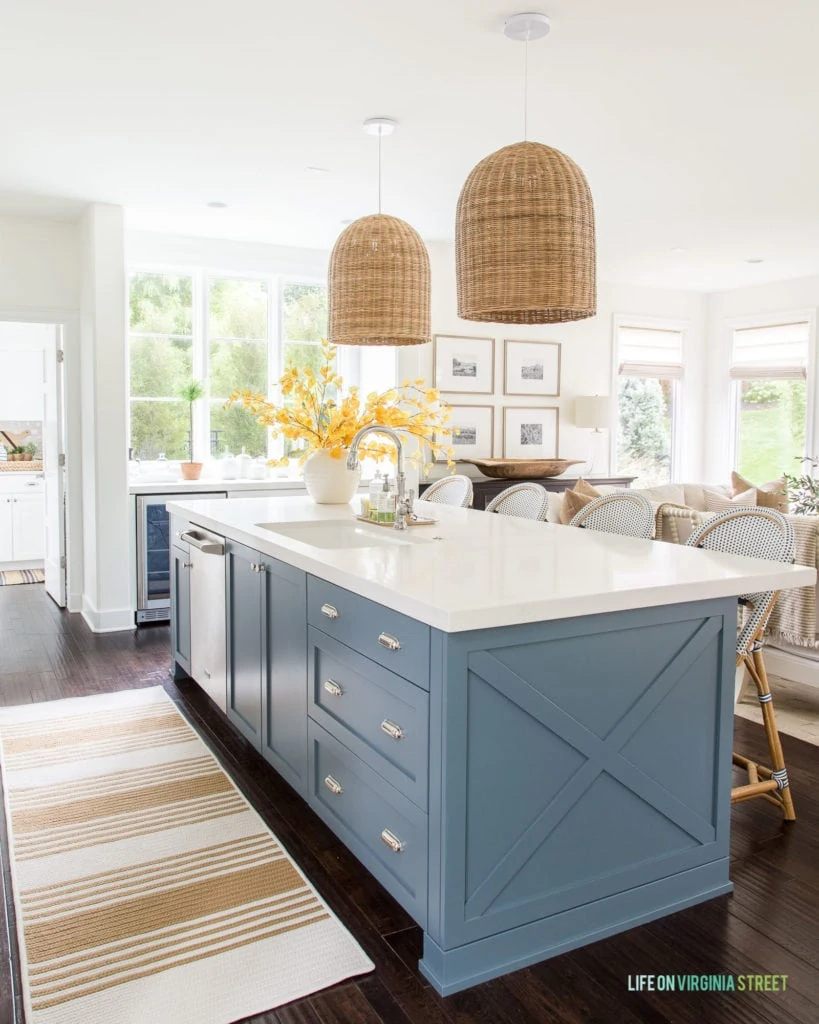
KITCHEN SOURCES: Basket Pendant Lights | Bistro Counter Stools | Striped Runner Rug c/o from Brooke & Lou | Similar Vase | Faux Aspen Stems | Topiaries | Oranger Diptyque Candle | Wick Trimmer | Cabinet Hardware: Knobs and Bin Pulls
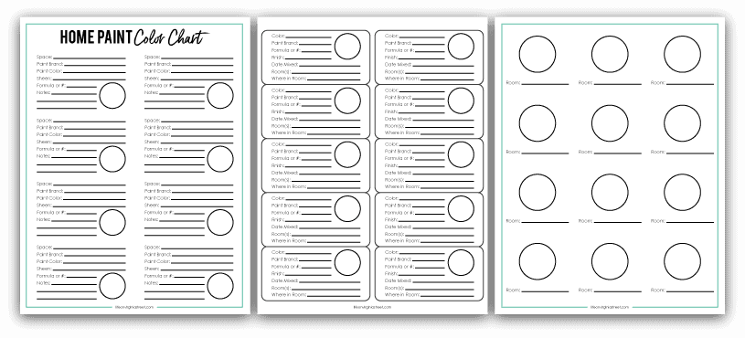
Free Paint Color Organization Printables
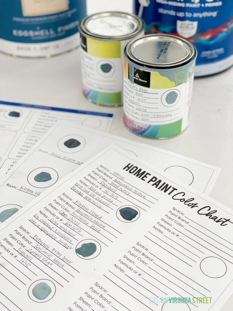
If you frequently paint your home like I do, it can sometimes difficult to keep all your colors (and paint cans) organized! I recently created a free paint color organization printable set that I think you will all love!
Simply complete the form below and I’ll email the PDF files over to you to start using today! It will also subscribe you to my email list, but you can easily unsubscribe at any time if that isn’t your thing.
Here’s how I use each of the pages:
I recommend filling out all the text first (or allowing a few hours of dry time if you add the paint first). I then use a Q-Tip to add the paint to avoid getting multiple brushes dirty. I then use each of the pages as follows:
- Page 1 – I print on cardstock to complete and keep handy around our home or near where we store our paint.
- Page 2 – I print on these labels and add them to the paint cans for easy identification.
- Page 3 – I shrink to fit on an index card to keep in my purse, or print as is and fold up to carry with me at all times. I simply add a drop of paint and the room name. You can think of it as your version of the graphic I shared at the top of this post! Just an easy visual reminder!
They are also useful if you plan to list your house and want to leave helpful information for the future homeowners!
Additional Paint Color Inspiration
If you’re looking for even more paint color inspiration, be sure to check out these other posts by clicking on their titles below:
- The Best Gray Paint Colors
- The Best Warm Gray Paint Colors
- The Best Blue Gray Paint Colors
- The Best Blue Green Paint Colors
- The Best Navy Blue Paint Colors
- The Best Black Paint Colors
- The Best White Paint Colors for Interiors
- The Best White Paint Colors for Exteriors
- The Best Green Paint Colors
- How To Pick the Perfect Paint Color and My Top Five Neutral Paint Picks
- Paint Colors In Our Home (and Every Color We’ve Ever Used)
If you would like to follow along on more of my home decor, DIY, lifestyle, travel and other posts, I’d love to have you follow me on any of the following:
Pinterest | Instagram | Facebook | Twitter
disclosure: some affiliate links used
In looking at your kitchen island picture, you mention the surrounding walls and trim are all Simply White, but the trim looks much whiter than the walls. Why is that?
Good question! It’s likely because the walls are eggshell and the trim is semi-gloss. So the trim definitely reflects more light! I hope that helps 🙂
Hi! What type of paint do you use in the bathrooms? Semi gloss?
I usually go with Satin because I don’t love the look of really shiny walls personally. But it’s definitely a matter of personal preference. You’ll definitely want something that’s washable though to take off things like hairspray, etc.
You have a beautiful home! I love the Hale Navy and plan to paint my powder room cabinet that color. Question, I’m painting all of our bathroom cabinets (2 guest rooms and master bath), my walls are a version of white (bleached linen), what neutral color of paint would you recommend? I just painted my laundry room cabinets BM White Dove with Behr Bleached Linen on the walls. I love it in there but worry it’ll be too bright in a small guest room bathroom. Also, my counters are beige marble with brown mixed in (from 1980). Any help would be appreciated! 🙂
Benjamin Moore Revere Pewter is usually a really nice neutral (not too gray or beige) that works well on cabinets!
Love everything you do! Would love to hear your thoughts on using some color in guest bedrooms. I’m so over off-white, feels cold. I’ve used a dramatic color on one wall, which is okay. You’re thinking about painting your external stone or brick, I say go for it. We lived in Omaha/Tomlinson Woods and I painted the brick on the home, initially the neighbors thought we were crazy, it transformed the house. If you have a “soldier” line of brick, leave that for an amazing contrast. Thank you for sharing your amazing ideas!
Thanks Deborah! Our bedrooms are some of the few rooms in our home that I haven’t painted white yet because I love a little bit of warmth in there. I prefer to keep it fairly neutral on the walls so that I can add color with throw pillows or bedding, etc. It’s much less of a commitment that way! But if you love more bold colors, I say go for it! Paint can be such a fun and affordable way to inject a little personality into a space.
Love these colors! My downstairs pretty much is one area (all the rooms just flow into each other and are not closed off at all). Would you recommend painting it all one color? (FR, LR, kitchen, entry, dining). Also, could you tell me what color you use on the ceiling? And do you use BM Simply White on all the trim in the bedrooms? Thank you so much!