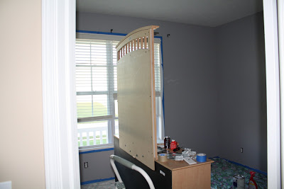
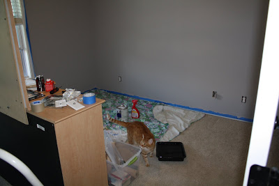
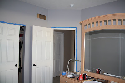
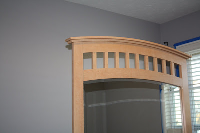
Well, I bought the paint discussed in my previous post (Benjamin Moore’s/Pottery Barn’s Nightingale). When I got to the store to buy it, they didn’t have any paint chips for me to look at but they said they could still mix the color. So, at this point I was still relying on the color from the catalog. When I opened it at home, it looked like a super light gray ~ almost silver. As it started to dry though it got much darker. The husband says he thinks it looks purple. And maybe he’ll “like it better after the second coat…” Honestly, I would rather have more of a purple tint than a blue tint. I don’t think it helps that we have those energy efficient light bulbs that cast a pink tint on everything. So, let me know your thoughts. I actually kind of like it and think it will look good once all the furniture is back and the funky carpet covers are gone. (Notice the Resolve bottle in the one photo…oops!)
Leave a Reply