I mentioned in our 2020 Home Goals post that we’ve slowly been working on some updates to the office. Although I still haven’t officially finalized our updates, I figured it was time I shared some progress since I keep alluding to it!
This post contains affiliate links for your shopping convenience. Click here to read my full disclosure policy.
Home Office Design Board & Plans
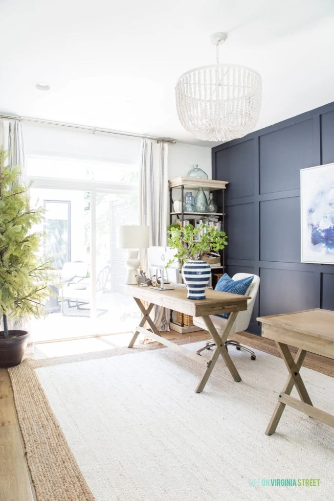
If you’ve been a long time reader, you may remember that our home office used to just be mine. It had one large desk and carpeted floors. But, after a few years, Kurtis needed a dedicated office space, as well, and it made the most sense to have two desks in this space, versus taking over another room. Here are two shots of the space the last time I shared the office mid-2019:
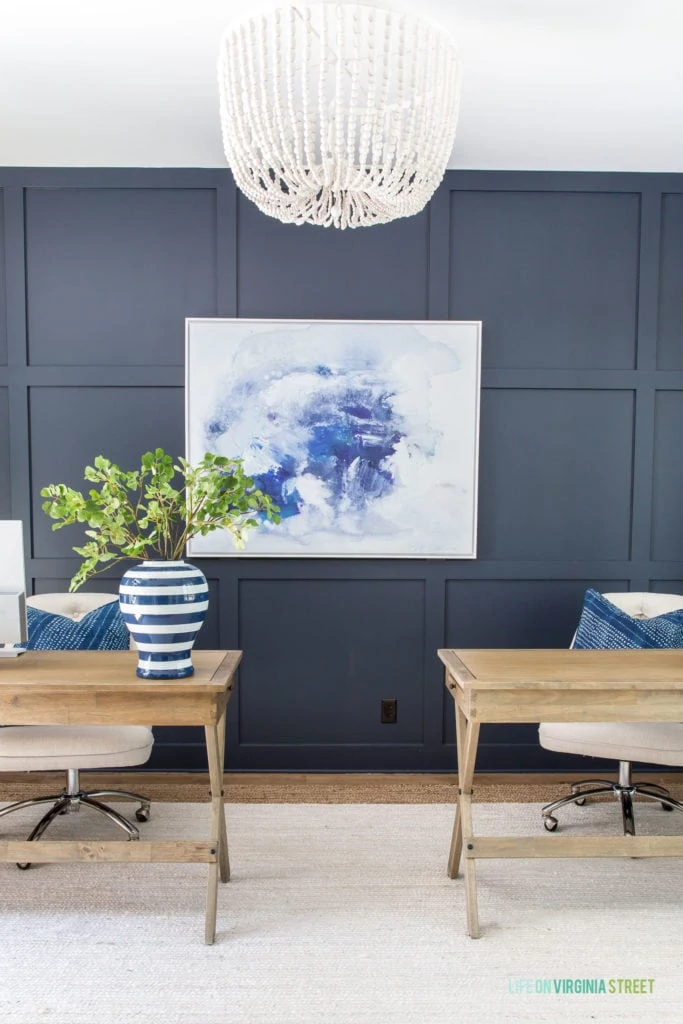
CURRENT OFFICE SOURCES: Wood Desks | Linen Chairs | Blue Dyed Pillows | Jute Rug | Striped Curtains | Bookcase | White Wood Bead Chandelier | Similar Lamps | Faux Ginkgo Stems | Similar Vase | Abstract Art | Faux Cypress Tree – no longer available
Our office is a workhouse and not a day goes by that it doesn’t get used if we’re in town. I rarely write posts or work from anywhere else in the house. I need quiet and focus and my desktop computer (I’m old-school)! Now that we’ve had the dual office situation for a few years, we’re a lot more aware about how we use the space and what makes the most sense for us. By last summer, it had become apparent that we needed to change a few things. Following was our updated wishlist of changes back in August:
- Get new bookcases that included at least one drawer. You can see the bookcases I considered here.
- Better optimize file storage in the closet.
- Find a rug that works better for the rolling chairs.
- Discussion on our office chairs. See more below.
- Find a storage solution for our larger printer/scanner.
- Possibly paint the office wall a bit lighter for a little less contrast.
Following is the tentative mood board I came up with.
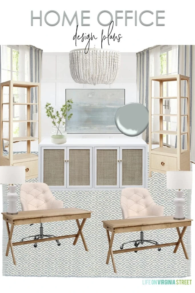
OFFICE DESIGN BOARD SOURCES: Campaign Desks | Desk Chair | White Wood Bead Chandelier | White & Cane Cabinet | Abstract Art | Grasscloth Bookcases | Rug | Drapes | Vase | Faux Greenery | Lamps
We already own the majority of the items in the design board. Next I’ll discuss how we’ll be using or changing each item!
Office Progress
After the bookcase post, I ultimately ordered a pair of these grasscloth bookcases. I got them during a buy more, save more sale so the savings were pretty big. I love the look, but even more so, love the drawer for hidden storage! Exactly what we were looking for.
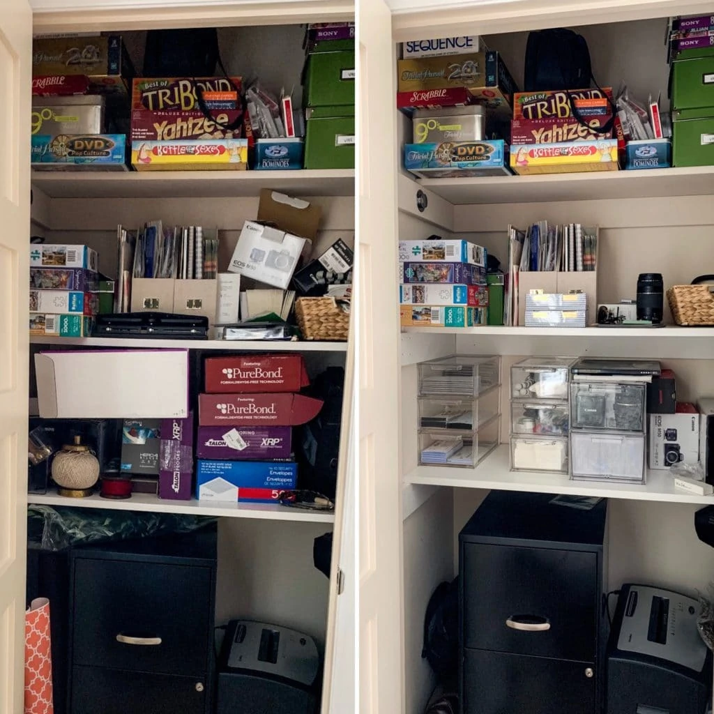
I’ve done some work on the office closet over the past several months, as I’ve shared along the way in our weekend recaps. It could still use a little more work, but overall I’m happy with the progress! These stackable clear drawers helped me get things a lot more organized!
We moved the old rug from the room up into our master bedroom just before Kurtis’ surgery. I still love the rug a lot, it just wasn’t working with the rolling chairs, as much as I really wanted it to. You can see in the design board above, I’m considering this rug from Dash & Albert (in the Swedish Blue color). They’re indoor/outdoor options are basically indestructible and can be hosed, bleached, etc. I’ve been so happy with any of the ones I’ve ordered in the past so I think this is a really viable option for the office too.
I’ve also had questions come up about our desk chairs. We’ve had these chairs for a while now and previously had this option. They both worked fine for a year or two, but with daily use, the seat becomes less and less comfortable. At this point, we’re still hanging onto the ones we have, but I’m just constantly keeping an eye out for a comfy option that we could eventually get. Kurtis requires arms, so it always limits our options. But, if the walls go lighter, I wouldn’t be entirely opposed to a leather option either if we found something we liked.
And, as I’m sure you’ve guessed at this point, the console table that used to be in our entryway is now in our office! You can actually see a peek of it there below. It’s the perfect option to store our massive scanner/printer combo. And surprisingly, rather than making the room feel cramped, I feel like it makes it seem so much bigger. And, all of the “decor” I felt necessary to have on our desks to make the room cuter can now go on the cabinet. It’s been such a good move in so many ways!
Office Paint Options
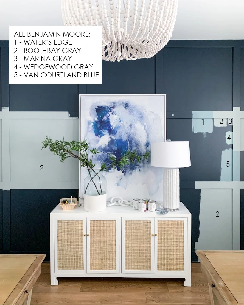
Lastly, in regards to paint. I love the Benjamin Moore Hale Navy that’s currently on the wall. I’m just ready for a change and want to lighten things up a bit. I’ve mentioned before this is a super quick project for me to tackle. It’s usually under $20 and less than two or three hours of my time. So it doesn’t scare me to try a new color. If I hate it, I can easily paint it back (I have plenty of extra paint left)! So, I did something over the weekend….
CURRENT OFFICE SOURCES: Campaign Desks | White Wood Bead Chandelier | White & Cane Cabinet | Vase | Faux Greenery | Marble Chain | Lamp (old from HomeGoods) | Abstract Art
I ended up picking up a few Benjamin Moore paint samples. The colors were from my favorite blue gray paint colors post (I had several of them already on hand). I don’t think I’ve officially found the winner yet. You can tell, I really wanted Benjamin Moore Boothbay Gray to work, but it reads super gray (with almost green undertones) in our office. Not seeing much blue (although it’s definitely there in others’ homes). It was Kurtis’ favorite option until he saw it in much bigger samples – we both agreed it’s way too gray. The colors are actually really hard to photograph in here (my phone keeps wanting to add yellow to everything). But I think the image above is a pretty accurate representation of how it all currently looks.
So, I’m back to the drawing board a bit. I’m really wanting a true muddy blue-gray paint color, but with the natural light coming in from two sides in this room, it really changes tones. The Water’s Edge color we have on our front door (#1 above) is really saturated and bright in here. The one I actually liked best (Van Courtland Blue – #5) is super close but just a little bit too saturated.
So, that’s where we currently stand on the progress! I’ll continue to keep you posted as we make decisions and finally wrap up this space! Hopefully fairly soon!
If you would like to follow along on more of my home decor, DIY, lifestyle, travel and other posts, I’d love to have you follow me on any of the following:
Pinterest | Instagram | Facebook | Twitter
disclosure: some affiliate links used
I was ordering some of these on amazon yesterday, I use them to store leather for my earring business, and one of the reviewers uses them to store board games. That might help clean up the top shelf of your closet!
https://www.amazon.com/gp/product/B01H2NWHXU/ref=ppx_yo_dt_b_asin_title_o01_s00?ie=UTF8&th=1
Before reading your comments, I immediately liked 2, Boothbay Gray the best LOL! I actually have it for all cabinets in my laundry room and at first i was totally unsure and now it’s my favorite. SO calming. Subtle yet makes an impact all at the same time. Paint is so hard – i probably spent 400 hours on it for our last build. CRAZY i know!
Maybe BM smoke or metropolitan gray?
How about a mix of #2 and #5?
My office has the same lighting problem with beiges, grieges and grays turning to more on the greenish side. I ended up going with Tucker gray. It’s more of a slate gray that has more of a bluish undertone rather than green. Check it out it’s by Benjamin Moore.
I’m getting ready to paint our bedrooms, when you say samples of Benjamin Moore paint, are those available at the paint store? I don’t want to buy a quart of each paint that I want to try.
Give wickham gray a shot. It pulls pale blue. Your space looks fantastic
I love that you are changing the color of the wall – What about the color blue that is on the inside of your front door – or another color to look at is Valspar Silver Dusk if you have never seen it. Vitrazza glass chair mats for office chairs are amazing – expensive but totally worth it.
BM Kentucky Haze is a great muddy blue-gray.