Far too often, I make progress in a room in our home but don’t end up sharing until I think it is officially “reveal” ready. Which means half the time I never end up sharing progress (unless it’s in a Weekend Recap) because I never think it’s good enough to share. However, I’ve decided that mentality is somewhat lame, and you guys probably appreciate the small projects just as much! Not only that, the small ones tend to be the ones that feel much more manageable to readers. So, today, I’m sharing with you a simple painted interior door update and the little makeover that followed in our entryway. Is it perfect? No. But still exciting nonetheless.
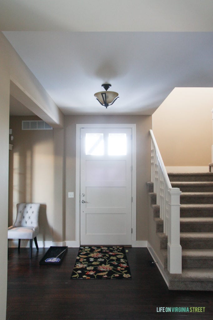
Before I show you the updated space, I thought it would be fun to take a look a prior looks in our entryway. This is how it looked shortly after we first moved in.
I then painted the entryway Behr Castle Path and styled the space a little more with items we already had on hand the first spring we lived in our house. We also updated the light fixture to something a bit more glam and bright. You can read more about that in this post.
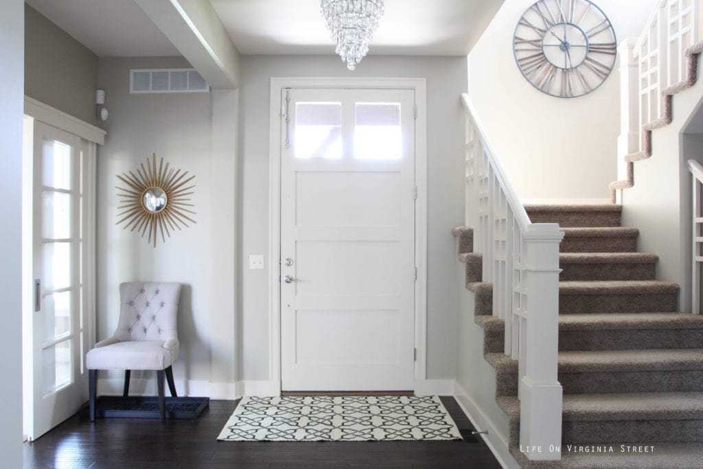
That fall (2014), I then decided to paint the interior of the front door Behr Elephant Skin to add a bit more interest to the area. You’ll notice not much changed. And to be honest, with the exception of seasonal decor, it pretty much looked exactly like this until this past week. I loved the look, but as I mentioned in my post on interior painted doors, I had really fallen out of love with gray. It’s just a bit too cold for my style as I move to a bit warmer feeling. I’m thinking of lightening up the wall paint down the road (Behr Castle Path). It only looks as bright as the photo below in perfect lighting, but most times of day it looks darker. But for now, the wall color stayed.
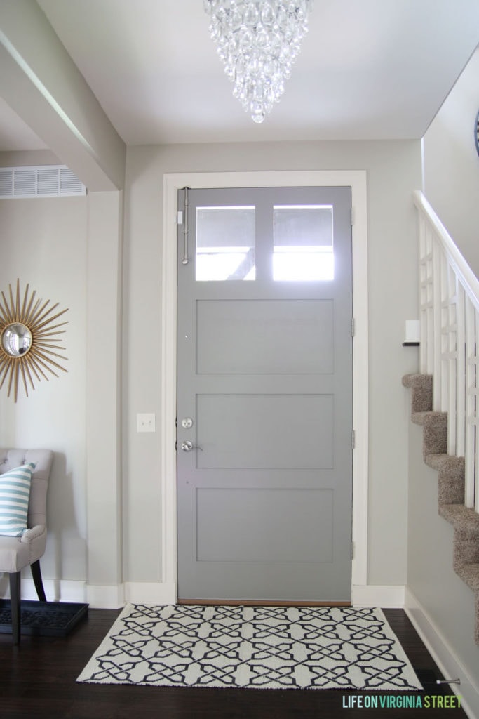
I sold the gold starburst mirror on a whim a few weeks ago on our local Facebook page, and that initiated the entire makeover. Once I started painting the office ceiling and realized how badly I needed to carry the white into the entryway, the more the makeover spiraled. I had known for awhile that I needed a larger entryway rug, and as of now, all of that has also been updated!
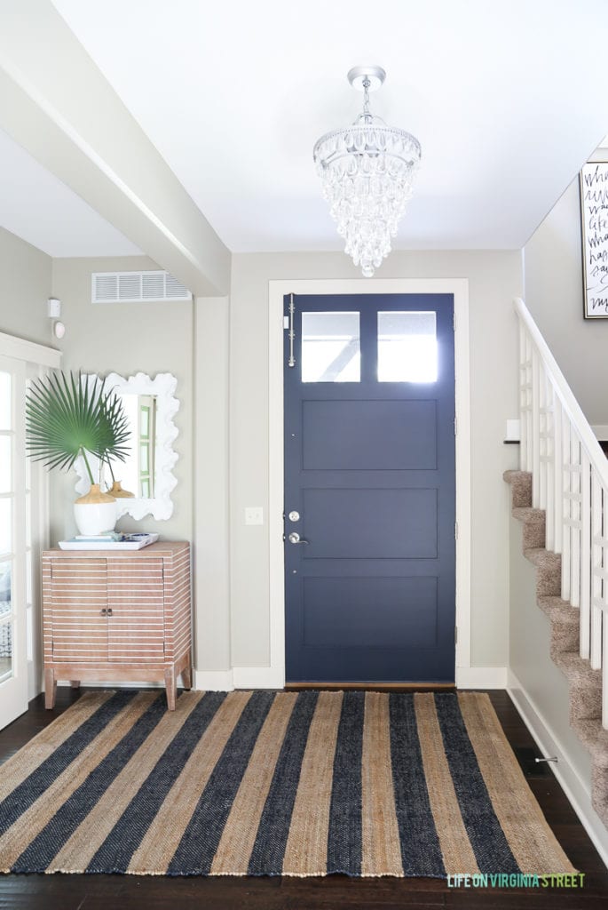
Here is how the space looks today!
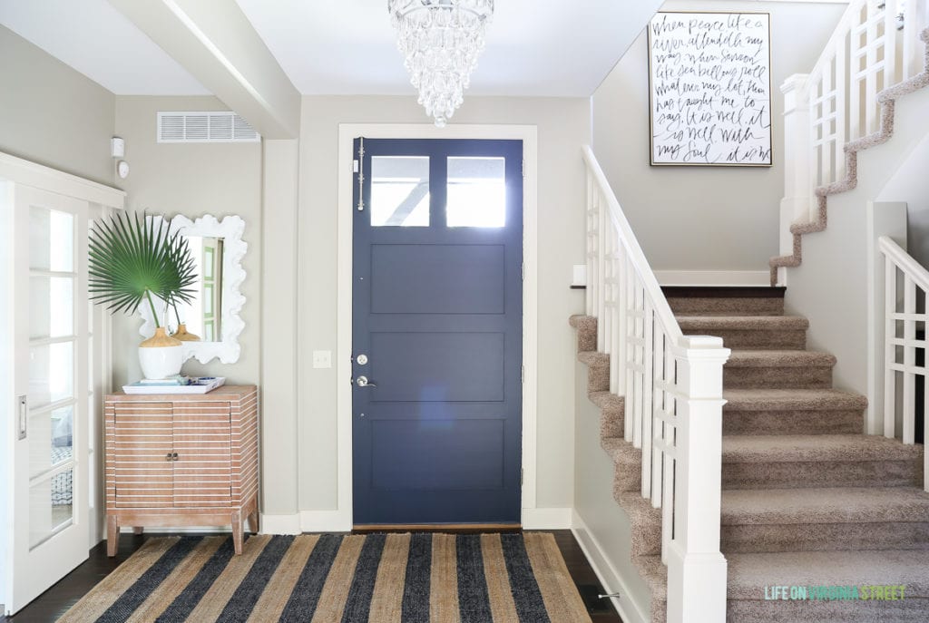
I painted the door Benjamin Moore Hale Navy to match our office and powder bathroom details. The change is helping things flow better and look much more intentional on our main level! I did two coats, and all in, the project took me less than two hours. I love that I could use paint I had on hand, and the only purchases I made for this entire space were the new striped jute rug and the white ‘coral’ mirror.
I brought the striped cabinet down from the guest bedroom , because once I added the feet it was too tall to work with the headboard as a nightstand. The chair that had sat in that corner for years was rarely used, and a table with a catch-all tray seemed like a much better alternative. These updates also help make the space look a bit more balanced next to our eight-foot tall door.
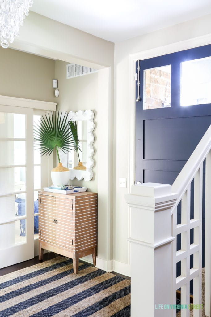
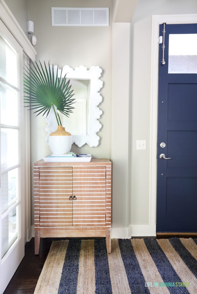
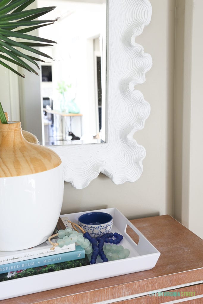
I love how much light the new mirror reflects into this previously dark little corner.
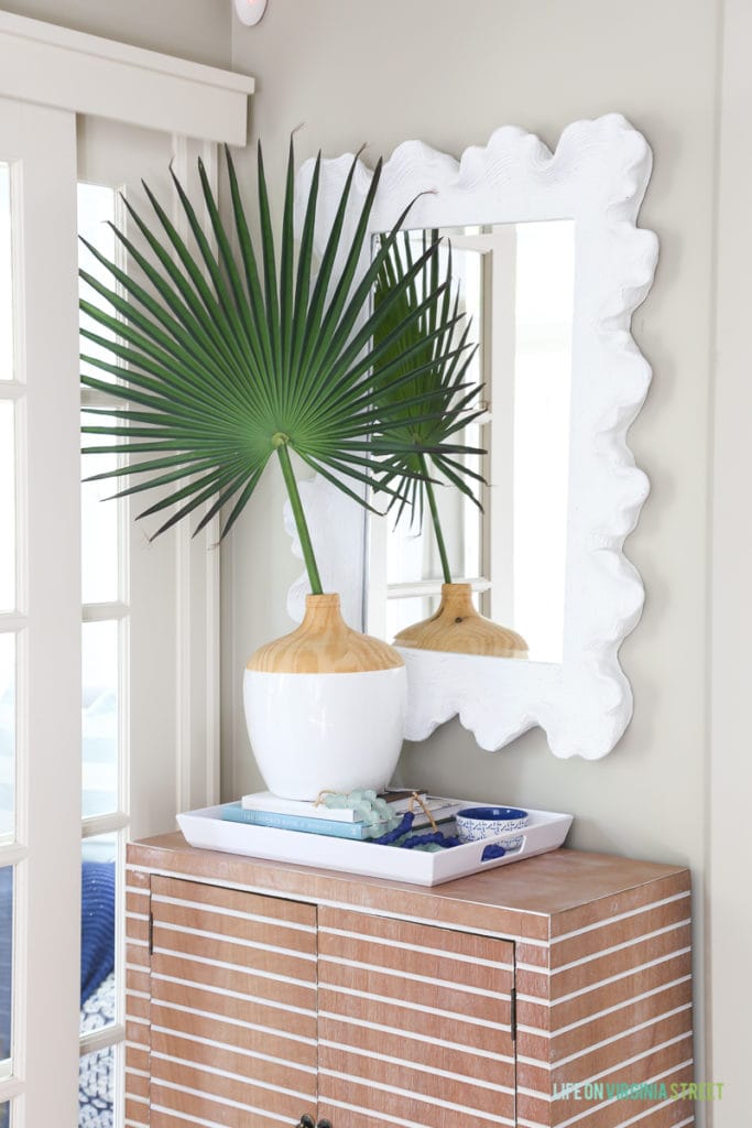
Not only that, I absolutely love the detail on the mirror. The ruffled edges and waves with the distressed matte finish is so beautiful and really gives off that coral vibe! Perfect for the beachy look I love.
Now I just need to finish painting the office doors white so that you won’t see the green frog tape in the mirror reflection! Overall, I’m really happy with how this makeover ended up! Stripes, palm fronds and navy blue forever 😉
I hope you enjoy this little update as much as I do! I know it’s not perfect and I’m sure I’ll make a few tweaks over the coming weeks, but it feels so good to have an entryway that better fits the style of the rest of our home!


If you would like to follow along on more of my home decor, DIY, lifestyle, travel and other posts, I’d love to have you follow me on any of the following:
Pinterest / Instagram / Facebook / Twitter / Google+
disclosure: some affiliate links used
Linking up to: Thrifty Decor Chick
Do you use a brush or a roller to get a smooth finish? Looks awesome .
Thank you! I used a small roller for smooth/semi-smooth surfaces (one of the fluffier ones – not foam). It definitely helps that I could work in grids because of the board and batten look on our doors 🙂
I’d love some info about the door lock you have! I’ve been searching for a nice-looking childproof lock for our doors.
Here is the link to the lock/surface bolt we used: http://bit.ly/2vjKuX9. We had to install it because our door is solid wood (other than the top section) and it was starting to warp badly and wouldn’t shut all the way at the top. But it’s a great safety feature too and would be great for childproofing your doors!
Wow! I love the change! More warmth and texture. Really beautiful.
Thank you so much Erin!
I like the new color – nice update. Do you have a link to the lock thingy you installed at the top of your door?
Thank you! Here is the link to the lock: http://bit.ly/2vjKuX9. We had to install it because our door is solid wood (other than the top section) and it was starting to warp badly and wouldn’t shut all the way at the top. But it’s a great safety feature too!
Love the new color! I just painted the exterior of our front door a similar color, and I’m tempted to paint the interior side the same color now. Thanks for the inspiration!
Thank you Steph! I think you may really like it. It’s such a fun (and cheap) update!
SO in love with this! The change is absolutely on point with the direction I see the rest of your home going. And I am totally inspired how you’ve styled the cabinet and mirror. Dare I say that your beaded chandy from the office would look pretty amazing in your entryway?? Just a thought! 😉
I also got the bug to re-paint the inside of our front door Hale Navy too! (Okay, maybe your previous teasers might have sparked it..) I’d painted it Revere Pewter last summer and loved it but wanted more of a contrast since we’ll be painting the rest of the walls a color similar to RP soon (to-be-determined). I LOVE the navy and the contrast, but it was such a change it has taken me a few weeks to get used to it. Have you had a similar feeling? Also, it’s taken some time for me to get over the fact the front of our door is black and that the navy on the back side wouldn’t compete with each other. I’m probably over thinking it!
Thank you Sarah! I actually sold that beaded chandelier a while back but agree it could have looked great too! And yes, it has definitely taken some getting used to the darker color here. But I’m really liking the contrast – especially with the same color in the adjoining office. 🙂
Love the new color and updates. When do we get to see the office???
.
Thank you Kathy! I’ll be showing the office once I finally finish painting it. The trim is taking FOREVER!! But I’m hoping no more than another two or three weeks until it’s finished! 🙂
Sarah, I love what you did in this space and the chest looks amazing there like it was made for that spot.
Do you have a link to the vase? I love the update!
Can I ask where you got the palm frond from? I’m assuming it’s fake and I would love one for my mantle. You may of mentioned it in the post but I didn’t see it!
I got it from Pottery Barn (it’s fake). It goes in and out of stock frequently. Here’s the link in case they re-stock again 🙂 http://bit.ly/2qUr1He
YES, these kind of updates are my favorite! Please continue to share them!
I love every part of this makeover! I’ve been thinking about painting a few interior doors and have been too nervous but this might be just the inspiration I need to get it started! Thanks for sharing 🙂
Yes yes yes! I saw your before post awhile back on Facebook and I remember voting for navy! It turned out beautifully. Now, I want to paint mine 🙂
Sarah, I am so happy to have found your blog! We are wanting to paint our door Hale Navy too and it is so nice to use your pictures for inspiration. I just have to finish painting the trim….
Thank you Mardi! Painting trim is the worst 🙂 But I think you’ll love Hale Navy. It’s such a great, classic color!
Love what you have done with your entryway. The color is amazing and the added decorative touches complete the space. Liked your progression of pictures as well to see how you completed your look. Great job!
Thank you so much Karen! 🙂
I love your new entryway! I just ordered a chandelier similar to yours although I think mine is a gold color. Did you buy it silver or did you paint it? I also love the “it is well” framed print by your staircase. Where did you get that?
Thank you! Jill
Thank you so much! Mine actually came silver. The ‘It Is Well’ canvas is from Lindsay Letters: https://lindsayletters.com/products/it-is-well-canvas.
Can you please tell me what your wall and trim colors are and the brand? Thank you
The walls and trim are both Benjamin Moore Simply White (in eggshell and semi-gloss)!
Nice transformation- One suggestion- Paint that grill vent the same color as the wall so it fades away- super easy to do- just take it down, clean well and paint with a small brush to help you get into the grooves. Use a really good brush.
Here is why I like the latest rendition: The blue door goes better with the stair carpet. The blue goes well with the overall organic theme ) the curvy mirror, natural entryway console (former nightstand), type of plant and rug. I have found that when I get it right I rarely want to change anything. Love the carpet size, pattern and material. You have created a very nice, welcoming entry while demonstrating that sometimes using what you already love but repurposing for another area really works.
The wonders of paint to create color flow and warmth, proper proportion of accessories (scale) decoupaging items one already has from vases to furniture to create color flow and enhance scale never ceases to amaze me. Was recently transforming some large indoor pot colors with solid color tissue paper (decoupage) for our master bedroom, the last room to finally get it’s finishing touches. A couple dollars on gift tissue paper and decoupage medium and they “flow”.
Thanks for the great article.