I’m off to Phoenix for the rest of the week on a business trip, but I have lots of things to share with you throughout the week. However, I plan to cancel this week’s Fabric Friday because I head out first thing Monday morning to Miami for another business trip and won’t be able to ship any orders for awhile. It’s that time of year!
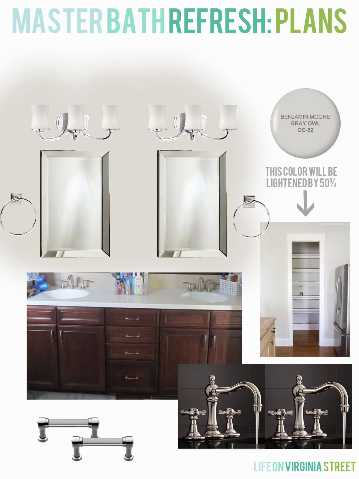
I posted here about my plans for a simple master bath refresh. Down the road we may do something about all the dark tile, but for now, I wanted to update with a few simple changes to make it feel more like us.
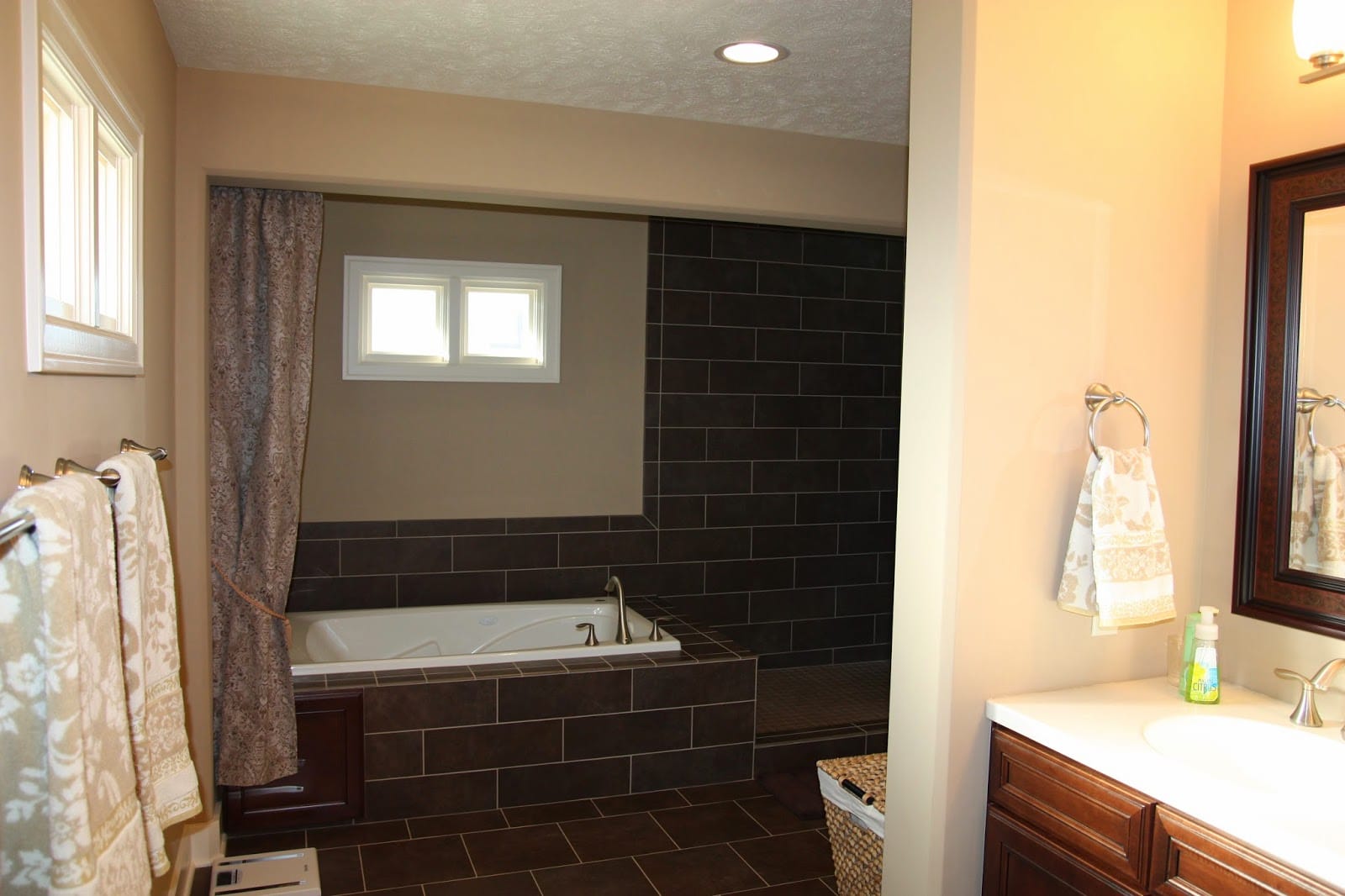
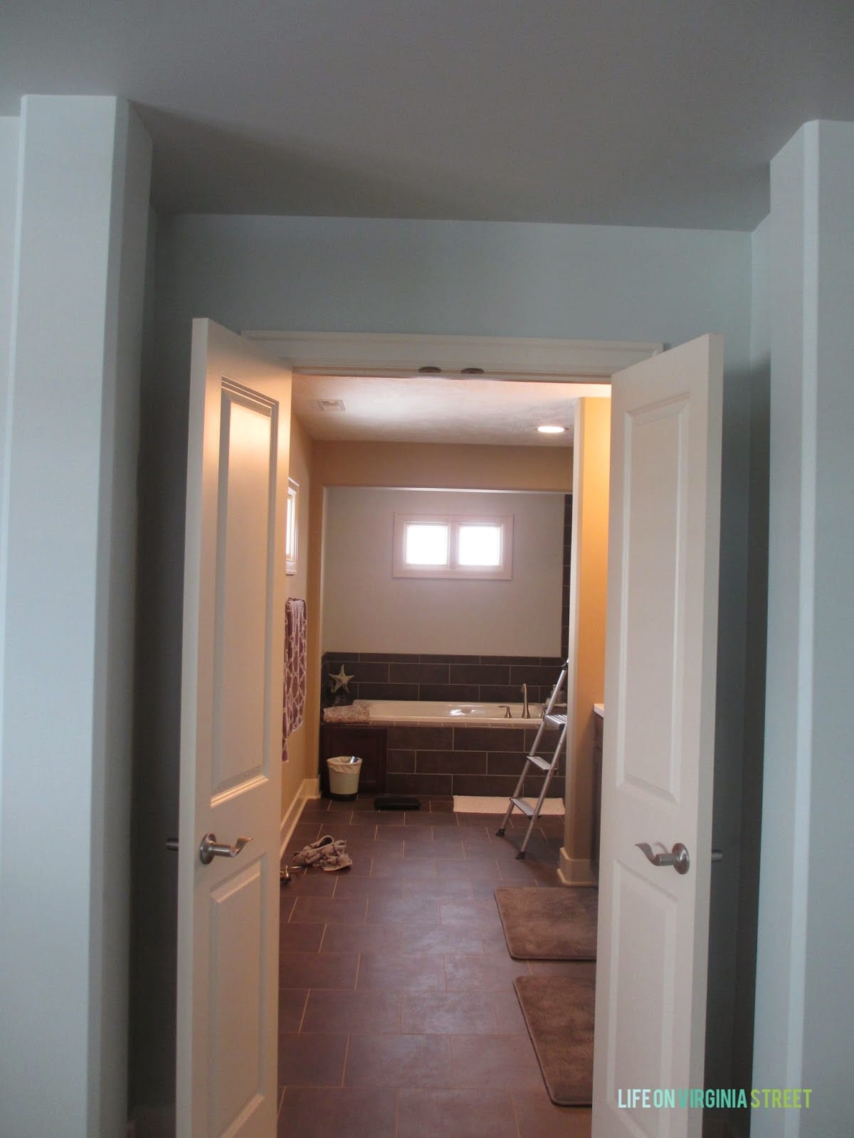
As a reminder, here is how everything started before we move in. Although, once we did move in, literally the only thing that changed was our towels were hanging on the racks instead of the prior owners.
I ran to the Benjamin Moore store and long story short {kind of} the guy there told me they don’t like to do colors as light as Gray Owl at 50%. I argued that I had “seen” many others do it online, but he insisted I just find a color I liked that was close enough. I left with a bunch of paint chips in hand and ended up at Home Depot.
I found the closest color to Gray Owl {from what I could tell in a rush and under fluorescent lights} and coincidentally it was Behr’s Dolphin Fin which I used on the stripes in the King Guest Bedroom. I asked the guy at the paint counter to go 50% on the Dolphin Fin and he did, no questions asked.
Saturday, I painted the first coat and it is already a dramatic difference! I went with a satin finish {as opposed to the flat paint that was already there} and it already feels SO much better.
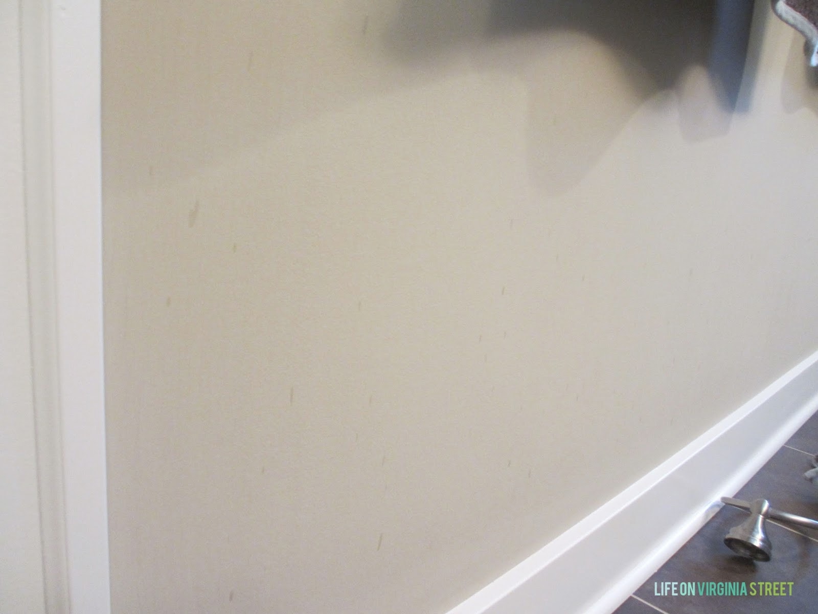
And this is a prime example as to why you do not use flat paint in bathroom. I don’t know if these are water spots, hairspray, whatever. They’ve been there as long as I’ve known and there is nothing you can do about it with flat paint. Except re-paint.
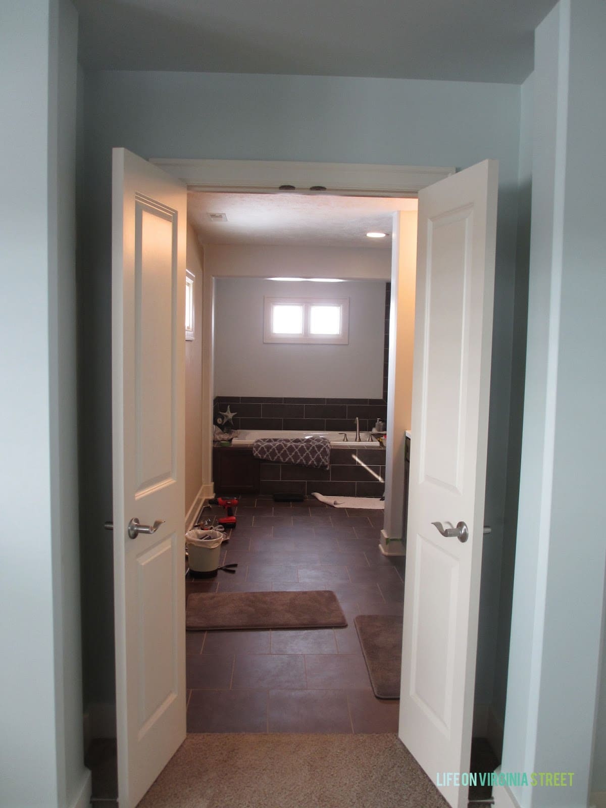
At this point I had only painted the two walls around the tub. Still a lot of orange tones in the room. Oh, and notice the curtain finally came down!
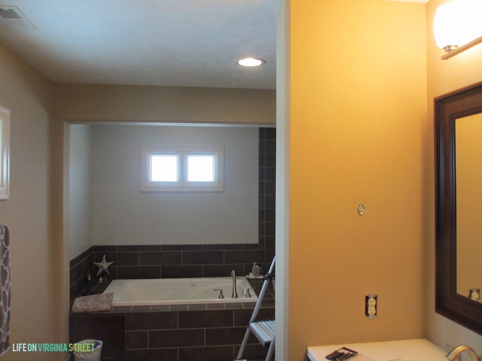
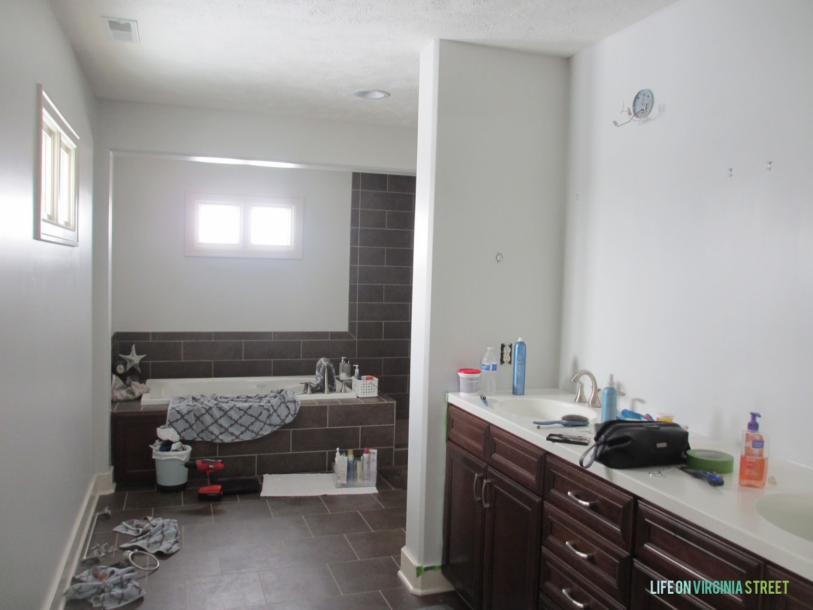
You can really see the contrast between the two paints in this shot. I think you can also see the difference in sheen. The gray is not only lighter and brighter, but more reflective and doesn’t just absorb all the light in the room.

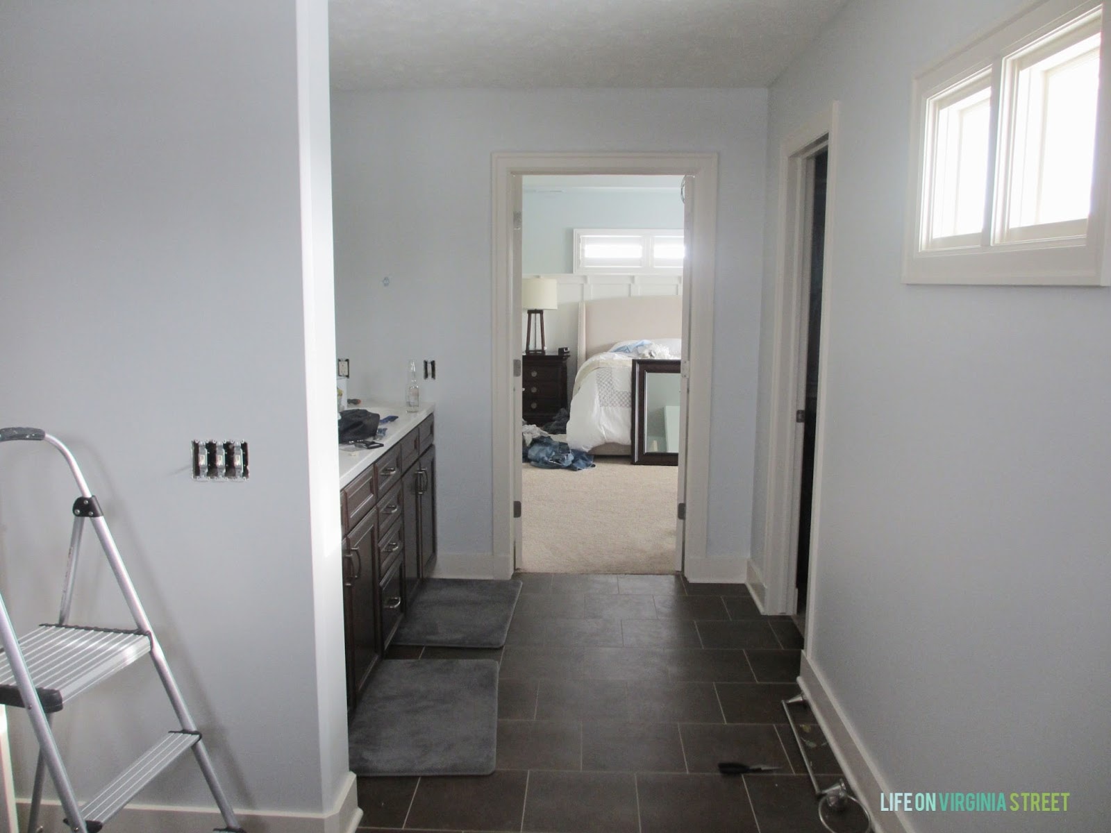
From the bedroom doorway, you can see how the room had less and less orange undertones as I would complete an additional wall.

Here is the whole room with the first coat of paint. I’m excited to wrap up the second coat next weekend. Even with the lights off, this room is SO much brighter!
Don’t judge the laundry in the background, people. Remember we had just come off eight days of vacation and you all know I would rather work on updating a room than cook/clean/wash clothes 🙂 It’s all about priorities – and laundry is definitely not one of mine!
The color is somewhat reminiscent of the paint in our last bathroom {Behr Light French Gray} but this has less blue in it {and I believe this will look even grayer once our trim is painted Swiss Coffee}. It’s amazing how that trim color turns most shades of paint bluish. We also plan to install hooks in lieu of the two mismatched towel racks that were on the wall previously.
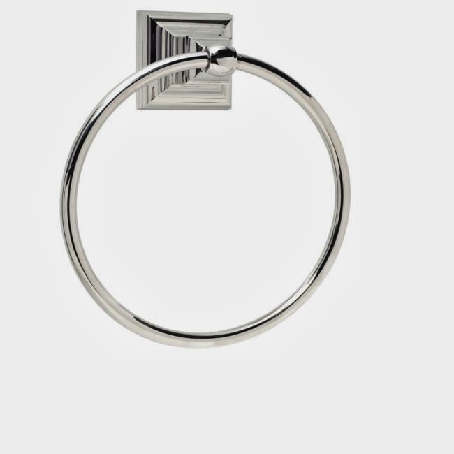
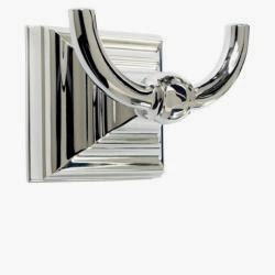
I ended up purchasing the Amerock towel rings I had in my original plan {for the sides of the countertop}, along with the coordinating robe hooks and toilet paper holder. However, rather than purchasing at Overstock like I had planned, I found them even cheaper online at Walmart.
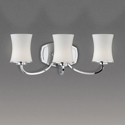
I will also likely purchase the lights in the plan which were $100 at Lowe’s – the Eurofase Dorado 3 Light Vanity light. I felt that was a fairly reasonable price after a power Google search and I couldn’t find anything else I like for less than $200 a light. The reviews I found on Wayfair we really good. The problem is we had to take down the existing mirrors and lights for me to paint. Ideally I would like for us to not re-wire any lights until I find “the ones” to use. Hopefully I make a decision on that soon. Until then, we’ll be getting ready in one of the guest bathrooms 🙂
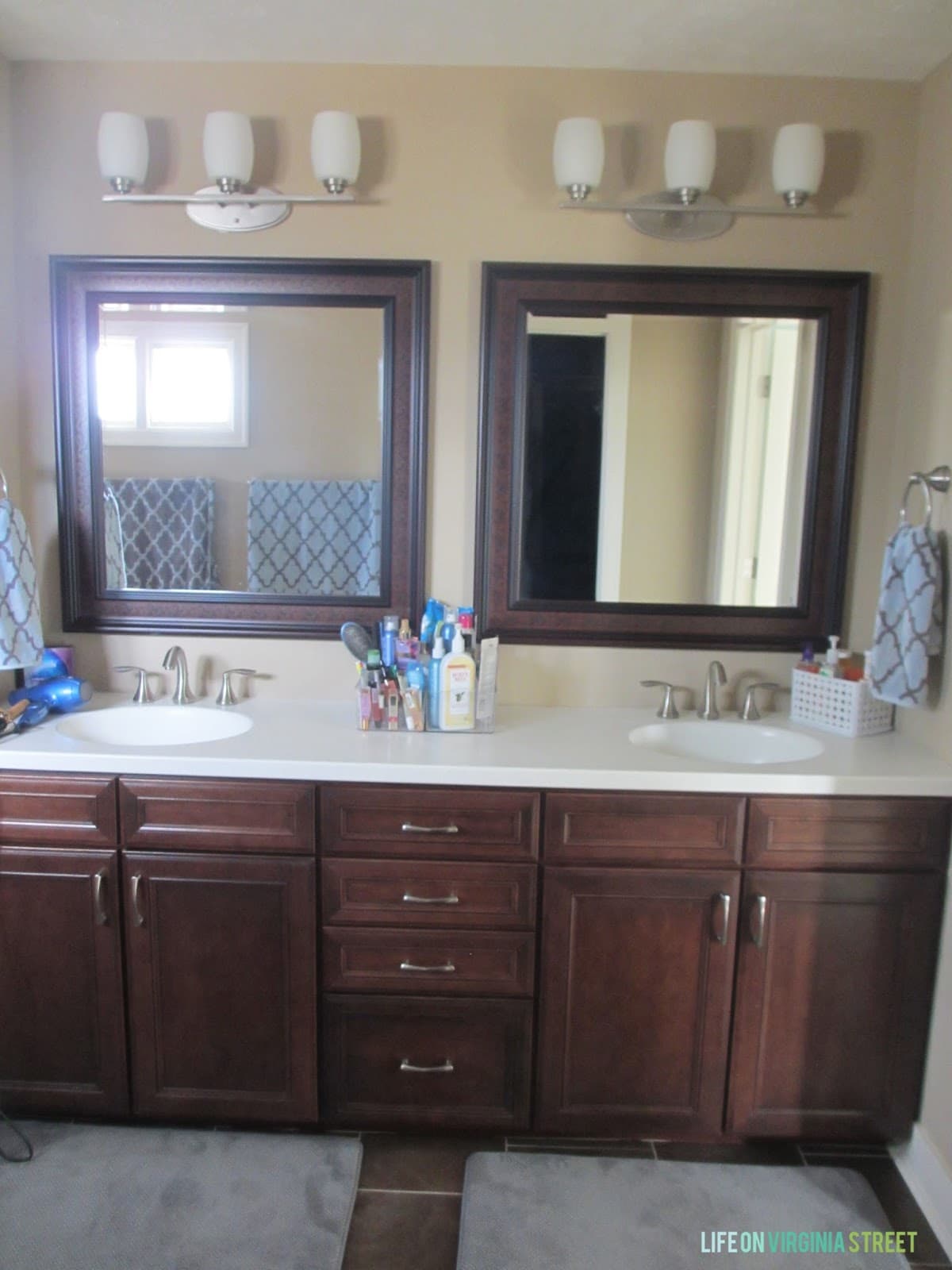
The mirrors are tough. In my inspiration post, I used some frameless rectangular mirrors. However, we’re thinking we’ll have to revert back to squares. Turns out, our lights are not centered over the sinks themselves. They are closer to the center. It isn’t noticeable with square mirrors because they fill the space. However, I worry with rectangular mirrors, the difference would be obvious. So, I may just stick to painting our existing mirrors as a solution. Here’s the picture from the inspiration post {pre-paint} to show you what I’m referring to}.
I’m happy with the progress so far and hope to get even closer to completion next weekend!
Later this week I’ll be sharing some progress I made in another room. Although, if you follow me on Instagram, it’s really not a secret what project I was pulling my hair out over! Stay tuned!
P.S. If you haven’t already done so, be sure to enter my Suave Sweepstakes for your chance to win $1,000!
Just to let you know that I just purchased the same lights but from Amazon for $88 and they are gorgeous!
Paint made a huge difference. The room looks larger and brighter already!
Can’t wait to see it finished! I live in Scottsdale and love your blog–enjoy this perfect weather! 🙂
Your bathroom is going to look amazing, Sarah. Just like every other room in your home! Can’t wait to follow the progress:)
Why do contractors think flat paint is ever a good idea? My paint guy looked at me funny when I told him there would be absolutely no flat paint on my walls when we built our house. Does he really not know how impossible it is to keep clean?
Anyway, your bathroom is so much lighter and brighter! Gonna be amazing. And talk about huge! Can’t wait to see it finished!
Jeannine @ The Concrete Cottage
Isn’t it amazing how paint always makes such an incredible difference-wow! Can’t wait to see it ‘closer to completion’:)