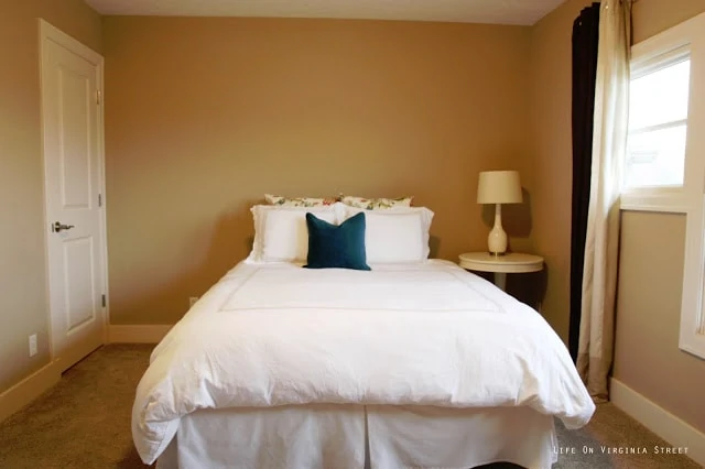
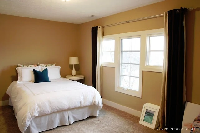
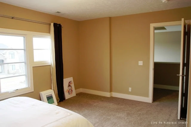
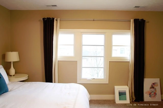
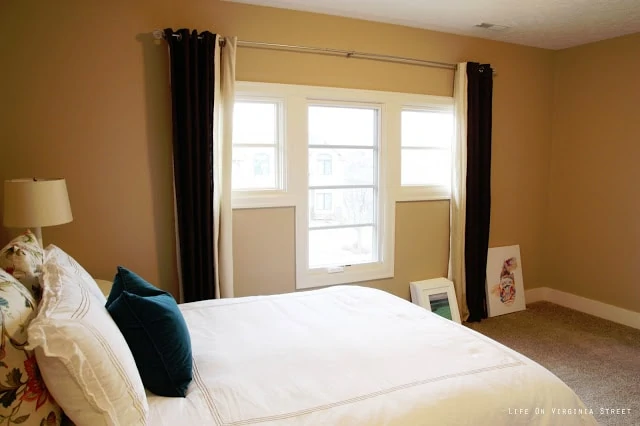
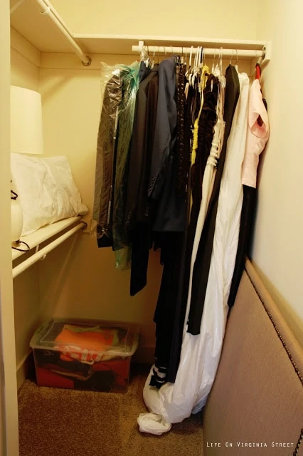
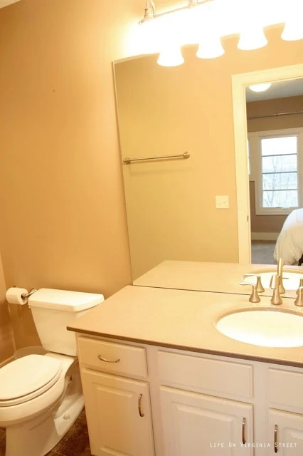
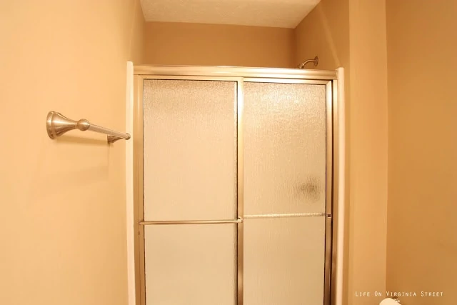
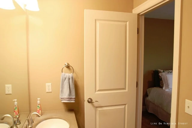
Formerly known as guest bedroom #1 which just sounded so generic. I will now refer to it as the queen guest bedroom {vs. the cali king guest bedroom}. Anyways, I have decided this is my new practice room. Originally I had planned to focus on my office, but those plans will be on hold until I can find suitable office furniture. I don’t want to wrap up the other items until I find the perfect desk, and in Omaha, that could take awhile. So, enter my new project room. I have a few things in mind – some of which involves installing a board and batten accent wall {all white}, new paint – and of course, painting all the trim around the windows and baseboards. Since this will be the least used guest room due to the bed size, I figured this is the best place to perfect my mad trim painting skills! The room is currently SUPER plain Jane, but has a ton of potential. To give you a full idea of what I will be working with, following are 360ish-degree views of the bedroom, the walk-in closet and the adjoining private bathroom – all of these are on the project block!
In the closet you can see our formal clothes as well as the DIY headboard I have yet to hang in the new room. I haven’t decided if that will remain or if it may be easier to get a real headboard, given that it will sit better against the wall treatment I’m planning.
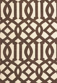
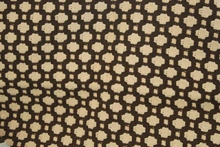
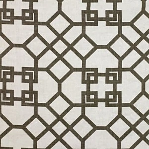
I have a handful of designer fabrics I have been hoarding so this may be the perfect room to put a few of them to use! None of these are intended to go together but I would like to use at least one of these in this room on one project or another. Not sure why the majority of them are graphic and brown and cream prints…
 |
| {via – kind of funny this was the inspiration for the Z Gallerie drapes in pillows in the guest room in our last home!} |
 |
| {via – Celerie Kemble’s Betwixt in Bear – this pattern is perfect for any accent pillows – I have the aqua version in our living room and I am obsessed with it} |
 |
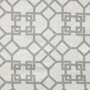
| {via – Quadrille China Seas Aga in Brown on tint – mentioned here} |
 |
| {via – Windsor Smith Pelagos in Clove} |
 |
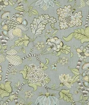
| {via – Windsor Smith Pelagos in Mist – I have some of this left over from our master bedroom pillows} |
 |
| {via – P. Kauffman Clarice in Dove} |
I really need to stop searching for designer fabrics {like the one I used in the office insipiration board that I am obsessed with} – even though I only need a yard or two tops, they are pricey! Here are a few others I am loving lately but don’t own {yet}!
 |
| {via – Schumacher Kelmscott Manor Print in Indigo} |
 |
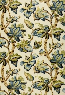
| {via – Thom Filicia Latika Pool} |
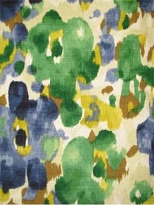 |
| {via – Robert Allen Landsmeer Ultramarine – I have never seen this in a room but I think the watercolor effect and colors could be really pretty – and it’s much more affordable at $20/yard!} |
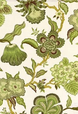 |
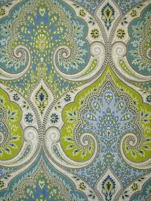
| {via – Schumacher Celerie Kemble’s HotHouse in Verdance – the same floral print in our master but in the green colorway} |
As you can see, I’m trying to keep our home in a similar color scheme even if the shades vary a bit – neutrals with blues and grays thrown in. I’d like to mix in one of the graphic prints with a floral of some sort. Any good fabric combos you know of using any of these fabrics? I also apologize in advance for being all over the place on projects. But I think this will be a good one for me to work start to finish – and hopefully we can get started on the wall treatment this weekend!
Love the Robert Allen Landsmeer Ultramarine. It’s different and since the colors in it are so versatile, it’s like a neutral without being a neutral…. if you know what I mean. LOL
Plus… Emerald is the Pantone color of the year.